640 – Smart Dates

clip_image002

For all the time that computers have been used, date handling has been a problem. Bad dates cause problems from sorting lists to processing payments, yet many systems force the user to figure out what it expects by way of date entry – from web sites which force 2-digits (a la 01/01/22 vs 1/1/22) to non-localised apps which assume a date format without allowing it to be changed?

If you ever say a date out loud like “this report is due by eight-one”, meaning 8/1 or 1st August, then 91% of the world’s population will need to interpret that differently to how they represent dates, since most will expect the format to be day-month-year, or arguably most sensibly, year-month-day.

clip_image004

Try saving things like expense reports or invoices using the file name starting yy-mm-dd or even yyyy-mm-dd and they’ll be much easier to handle (aside from just sorting by created date, of course).

When a user enters a date into a Windows app, the vast majority will respect the format set by the operating system, known as the User Locale.

clip_image006That doesn’t help too much if the author of a spreadsheet – for example – is in one locale and clip_image008other users are elsewhere; if the default date format is numeric, then the field remains in the format of the author, and that may cause befuddlement.

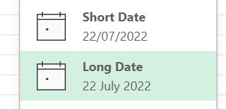
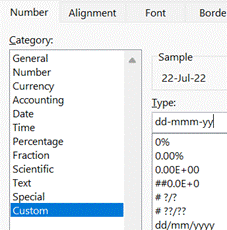
Switching display format to Long Date – or even setting a shorter custom format – could avoid confusion. Under the covers, Excel still stores the date in a universal format, but people might interpret it incorrectly when display in a different format.

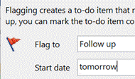
clip_image010Other tools can handle dates in surprisingly smart ways – even since its first version in 1997, Outlook lets you enter text into date windows like a Due Date for reminders or tasks – any time you are presented a date field that lets you type as well as select a date from a calendar picker, you can put stuff in like tomorrow, 2 weeks, next Friday, third Tuesday in October etc. There are shorter versions – 2w, 3m 10d – or you can string things together, like Monday before Christmas.

clip_image012Microsoft To Do has also has some date smarts; if you type in a new task to track, it can read dates and times out of your task description and automatically set due dates and Reminders.

clip_image014It has other kinds of parsing – in 3 days etc – though not quite as comprehensive as Outlook’s. There are also a load of special dates recognised (at least in the US).

So far, this functionality is available on Windows and iOS apps and for the most part it’s really neat. If it detects a date you don’t like – you’re suggesting something may happen, rather than it is happening on 1st May, for example – then just hit backspace to clear that association.

#639 – Macros, Ghosts and GALs

VB and MacrosSince the early days, Microsoft always kept an eye on what its competitors were doing. It was once de rigeur to produce “battlecards” which would show feature-by-feature how one product is better than its competitor, thus assuring the customer they should buy this one. Thankfully, times have mostly moved on to just building as good a product as possible and then let customers and the markets decide – sometimes, they get improved and honed over time to be the best out there, and sometimes they get dispatched to the boneyard as times move on.

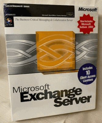
Exchange Server boxIn the late 1990s, Office and Exchange (and later, SharePoint) Server were seen as Microsoft’s entrants into the burgeoning “Groupware” market, which became subsumed into “Knowledge Management” c2000. Key competitors to Exchange & Outlook were Lotus Notes and Novell GroupWise, both of which came from being collab tools and gained email functions. Notes was arguably much more mature and feature rich even if the UI was sometimes clunky, GroupWise was much leaner but found a niche in several industries. Amazingly, GroupWise is still a thing and Notes evolved first into IBM Notes/Domino and was eventually sold off to now be HCL Notes and HCL Domino.

One of the early moves Microsoft made to elevate Office apps to more than just writing documents, was to try to make the docs more capable through adding Macros, and later, Visual Basic for Applications. This allowed a moderately skilful user to dabble in programming to make smarter applications centered around documents; what seemed like a good idea at the time unwittingly unleashed a wave of malware, where bad actors wrote macros to do undesirable things. Following the “Melissa” worm in 1999, Office stopped Macros running without asking the user for permission. Using Macros for anything more than tinkering never really took off.

Blocked Macro warning

Macros disabled entirely

Microsoft announced in February 2022 that all Office Macros in content received online would be disabled completely; this was temporarily rolled back in some test builds for some changes to be made in how it works, but for many, the warning will still be there if you open a Macro-enabled file that you’ve downloaded or been sent.

Unblocking MacroThere are still some very useful Office macros out there, and if you do need to run one that you know is from a trustworthy source, there is a workaround – save the file to your PC locally, then right-click on it to look at the file’s properties, tick the “Unblock” option and apply that. You’ll now be able to choose to run the macro unencumbered.

One such handy macro was discussed back in December 2021 in ToW 611, and is used to find Ghost meetings – ie ones you have arranged but everyone has declined (or at least not accepted). The macro spins through all future meetings in your calendar and lists the ones you’ve organised but where you’re likely to be the only attendee who shows up. Particularly useful at this time of year if lots of people are about to take time off over the summer, and may have declined a few recurring meetings but you – as organiser – still have them in your calendar.

Ghost Meetings

For the latest version of the macro, download the ZIP file to your machine and expand it (or just copy the XLSM file that’s within and put it somewhere else), do the property Unblock thing as above, open in Excel, click the button to allow content, then the Scan Calendar button and you’re all set. You still need to go into Outlook and look at the appropriate date then decide if you want to cancel those meetings or not.

Another more powerful macro – though a little more esoteric – is one which does bulk resolution against the Global Address List, so if you give it a list of display names and/or alias names, it will show the full name, title, department, office, email, and alias name of that person. Handy if you want to get the full details of everyone who is going to attend a meeting, but if you just have a longish list of names then you could just paste them in and see how it goes. This was covered back in ToW 575. One usage scenario recently was to estimate the number of people who were attending a group meeting, but were based at other offices and would therefore need accommodation.

Here’s an example output of over 500 names who were invited to a large meeting; by just providing their display names in column A, it took the sheet about 30 seconds to complete, with 10 identified as distribution lists and 50 unknowns who couldn’t be resolved, either due to no longer being in the GAL or because there were more than one possible name listed.

GAL resolving

If you can manually find the unknown person/people in the GAL, then get their alias name and paste that into column 1 instead of the ambiguous display name, then try to run it again.

635 – Outlook Wunderbar and Full Screen

Outlook iconMany Office users rely so much on Outlook, it’s their most-used application by far. Over the years, numerous other apps – such as Yammer, Slack or Teams – have presented other ways to collaborate and communicate yet with billions of messages being sent every day, email just doesn’t seem to slow down.

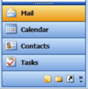
Outlook 2003 WunderbarThe bones of the current Windows release of Outlook date back to Outlook 97, with some dialogs and settings having changed little since even if the main UI has been refreshed over the years. One recent change was the further evolution of Outlook 2003’s “Wunderbar”, the menu on the bottom left of the main Outlook window that switched views between mail, calendar, tasks etc (yes, it really was called that internally – look in the Registry).

Outlook 2016 navigation barBy Outlook 2016, the navigation bar had collapsed into a series of icons along the bottom, which did the same thing but took up less screen real estate. It’s long been possible to use keyboard shortcuts to jump between the options on the navigation bar – CTRL+1 will go to the 1st one (usually Mail), CTRL+2 to the second and so on. You can reorder the options on the bar if you like, so CTRL+1 could be Calendar if that’s what’s most important to you.

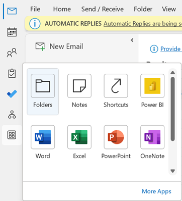
configuring the Outlook 2021 navigation barOutlook 2021 changes things again – the navigation bar has moved to the side, in a UI design shared with both Outlook.com and the Microsoft 365 Outlook Web App.

Other apps can be pinned to the new bar, too – including things like the Org Explorer, which presents a much more graphical way of looking at the org chart than the old Address Book in Outlook.

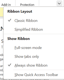
Adjusting the ribbonMoving these icons to the side of the screen might help organize screen real estate; another option would be to collapse the Ribbon, so you only see the many icons and options along the top of Outlook, when you need to use them.

You could try Simplified Ribbon to reduce the size and hide some of the more esoteric functions.

Show tabs only reverts to a simple menu bar, and when you click on one of the options, the ribbon for that tab is displayed. You can toggle easily between Tabs Only and the full ribbon by pressing CTRL+F1. There are loads of other shortcuts for Outlook though some are a little obscure.

Full-screen modeTo truly maximize your screen area, try going into Full-screen mode;  that removes the menu and ribbon at the top of the screen entirely, including the search box.

If you need to search your mailbox while in full-screen, press ALT to temporarily display the ribbon, and look for the highlighted keys that can jump to specific tab or function.

Press ALT to see shortcut keysPress Q, then type your search, hit enter and you’ll return to your results in full screen again.

631 – Why does nobody share calendars?

A paper calendarBack in the late 1980s/early 90s, IBM had an internal email system called NOSS – an implementation of PROFS, a text-only mainframe-based system delivered via a terminal.

Even in 1990, NOSS allowed any user to browse a hierarchical directory (showing contact info, job titles, manager/reporting relationships etc), email or instant message anyone, and look at their calendar to see what they block of text about IBM's NOSSwere doing. It was 10 years before you could do all those things using Microsoft Windows and Office. In recent years, Big Blue’s email environment has seemingly been less happy.

When Microsoft Exchange first came out, email was handled with the Exchange client and calendaring was from Schedule+, which had been updated to support Exchange (and lives on in some backward Microsoft lingo, where people who start every sentence with “So,” ask you to send them an S+, meaning, invite them to a meeting). Outlook came along in 1996 and became the preferred and unified way to do email, calendars, address books etc.

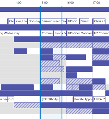
Schedule view of free/busySome organisations had a default policy when new mailboxes were created that their calendar was shared Read-only, so anyone in the company could see it. You could open someone’s calendar fully in Outlook or by viewing the scheduling tab in a meeting, where you will typically see if a list of people are available or not. Others might have it that only free/busy info is visible by default, and that is pretty sub-optimal.

With M365 in general, newly-created mailboxes have no calendar sharing set up, and the action is on the user to choose how to let co-workers see their info.

Be a nice person, and check to make sure your colleagues can view your calendar.

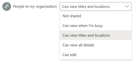
Ideally, share so that others will see the title and location of any appointment; useful when someone is trying to arrange a meeting, as within the schedule view they can figure out if you are likely to be able to make the proposed meeting time – if your diary is full of blocks marked busy or tentative, they’ll have no idea if you really are in a meeting or have just marked time to do something that you might be happy to move. Or had a colleague’s FYI notice of being on holiday obliterate the view of your calendar.

In the early days of Exchange/Outlook, if you had read access to someone’s calendar, you could open up appointments, see who else was attending a meeting, download any attachments and so on, unless the appointment was marked “Private” – though it’s somewhat possible to open Private appointments programmatically if you know what you are doing.

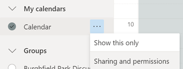
OWA sharing persmissionsNowadays, calendar sharing is more granular – in Outlook Web App, go into Calendar and you’ll see the Sharing and permissions option, which will let you choose specific people and give them ability to see various details, or you can change the default for the whole organisation.

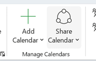
OWA sharing persmissions detailIn full-fat desktop Outlook, click on the Share Calendar option on the ribbon, and you’ll get a 1990s-style dialog box Sharing permissions in Outlookallowing you to set the default permissions or to invite particular team-mates to have higher level access should you want them to know where you are and with whom.

If you choose titles & locations, viewers can’t open your appointments to peer inside, so can’t see who else is attending or what the body of the meeting says, but they can at least see if you’re likely to need travel time between meetings. See here for more info on calendar sharing & delegate access.

630 – slimming your PPT

Piles of documentsPowerPoint files can get big. In the scale of small vs large, sending a many-megabyte PPT file around between a few people might not matter much, but if you’re building a presentation that is going to be widely shared, it could cost actual money – data storage costs, bandwidth charges on a website, carbon footprint for transmitting and storing etc.

Estimates of the energy cost to transmit and store data vary wildly, but if 1 GB cost 1 kWh power and the average CO2 output for generation was ~500g/kWh, then even shaving 10MB off a file can make a material difference if it’s going to be heavily used.

There are a few tricks you can follow to make your PPTs less massive – like compressing the images within, meaning that an embedded picture which was originally sized to print on a poster could be re-sized to fit on a screen.

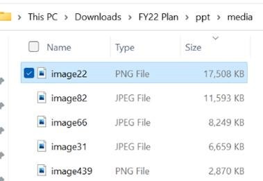
File sizes sortedIf you see a few-slide presentation file and it’s dozens of MB in size, then there’s probably other info in the deck which is not necessary for your presentation. Even more likely is that there are some embedded graphic or video assets which are bloating the size of it. Quickly identifying the cause of such largesse might allow you to ditch the offending slide or resize/remove the content.

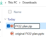
A somewhat cavalier way of looking for large things you can torch, is to make a copy of your PPTX file and then rename it so you can look within. The OfficeXML file formats (prevalent in Office 2007 and onwards) use the same compression as ZIP files, so if you rename your file as such, you’ll be able to open it in Windows Explorer or other ZIP handling utilities, to see its innards. Opening the file shows you a folder structure, and if you navigate into ppt \ media then sort by Size, you’ll quickly see what’s making your file so big.

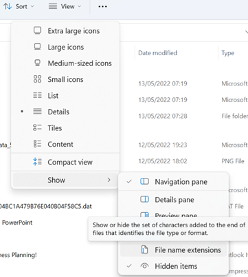
File Name extensions optionActually doing the rename might be trickier than you think, since Windows hides by default such grubby detail as file extensions. One trick is to flip the switch to show extensions again (in Windows Explorer, look under View menu / Show / File name extensions), then it’s a simple matter of changing the file in Explorer by editing the last part of its name from .pptx to .zip.

Renaming file in ExplorerOnce you’ve confirmed in the warning dialog that the apocalypse is nigh and you really do want to change file type, open the new ZIP file and you’re off. Remember to go back in and switch off the Show > File name extensions option if you’re so inclined.

Renaming file, command lineIf you’re still unsure about these new-fangled “gooey” interfaces, you could crack open the command line to do it quickly.

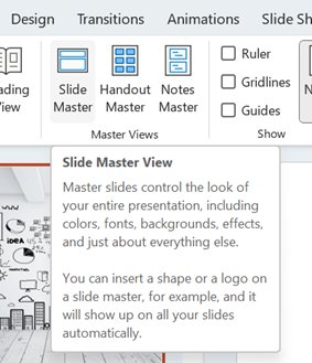
Slide master viewIf all this grubbing about inside PowerPoint files makes you feel uneasy, there is one other trick that could yield dividends – look inside the Master. Since many people create a new presentation by starting with an old one, they liked, it’s very possible there are slide layout templates with embedded graphics that you no longer need – especially if the originating deck was produced for a conference.

Go into View menu and look under Slide Master, which will open a whole new tab specific to the management of these template slides that form the bones of the presentation. You may well see lots of title slides or similar, which have embedded background images – if you know you don’t need those graphics or those layouts, just delete them.

Closing Master viewPowerPoint generally won’t let you ditch a master layout which is being used to format the current slide deck; so, if you have your deck already built and want to distribute it, just go into the Slide Master view, delete everything which looks unnecessary and that PowerPoint will allow you to, then Close the Master view to return to the main menu. Once you’ve checked that the presentation format hasn’t been garbled, go File > Save As and give it a new name. Now compare the size of the new and old files.

Super Massive background graphic

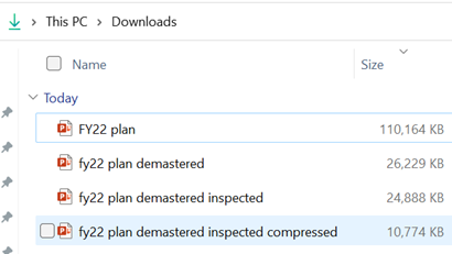
This title slide in the Slide Master view had a graphical background which was 17Mb in sizefile sizes compared; just deleting all the unnecessary visual slide templates dropped the size of the original file from 110MB to 26MB.

Compress pictures dialogRunning the Document Inspector to remove other content further dropped another 1.5MB.

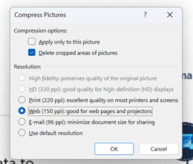
Selecting an image from one of the 70-odd slides in the deck, and choosing Compress Pictures from the Picture Format tab reduced it again to only 11MB, or 10% of the original file size – all for a few minutes’ effort.

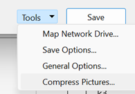
Tools from Save As dialogGoing back to the original 110MB file and opening File > Save As, then choosing More options… will open a traditional Save As dialog box; on the bottom is a Tools > submenu which allows you to run the Compress Pictures function at the point of saving the file, so reducing it to 1/3 of the original size, for literally 15 seconds’ work.More options of Save as dialog

NB: the irony of sending a 2MB email to thousands of people, and sharing online and on LinkedIn, is not lost.

628 – Text handling in Excel

Excel logoAnyone who has delved into writing formulæ in Excel will probably have had to manipulate strings of text at some point, possibly to clean up formatting or to convert what Excel thinks is a simple block of text into more meaningful data that we know it to be, like a number or a date.

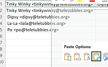
There are simple ways of bulk handling text without resorting to writing a formula – copy all the names from the To: line in an Outlook email, for example: paste into a new spreadsheet and you’ll end up with pasting email addresses into Excela single line of text containing all of the display names and email addresses in one cell, which you may want to split up, to be of much use.

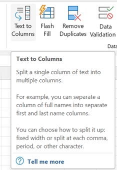
Text to ColumnsSeparate the text into multiple columns by selecting the first cell, then go to the Data tab and look for Text to Columns, which presents a fairly powerful if somewhat old-fashioned looking dialog box, to step through fixing up your text.

In the example above, we have a “;” separating – or “delimiting” – each address, so clip_image008we’ll use that to split the text across multiple columns.

Transpose Paste SpecialSince we might want to create a table of names / addresses, select the cells spread across the columns, copy or cut them to the clipboard, then on a new line below, right-click and look for the Transpose option under Paste Special. Once that’s done, feel free to delete the original top row, or clear the contents of the first cell as we might come back to that row to add column names later.

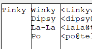
There is some other cleaning up to do with this text, though; the Text-to-Columns function chopped everything at the “;” but there’s a space which follows the semicolon, so all the Display Names after the first one have a leading space. We could repeat the Text-to-Column feature on the selection again, but use a Space as delimiter now – Preview Text to Columnsunfortunately that would mangle the display names into multiple columns, and if we had a smattering of users with middle names or 3 or 4 part names common in many countries, it could make things look even worse.

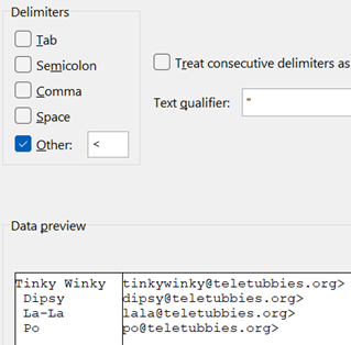
Use custom delimiterUsing the leading “<” of the email address as the delimiter is probably simplest, as it will separate the name(s) and email addresses out, though it does still give us a few tidying-up challenges, as there are spaces we don’t want and a trailing “>” at the end of every email address.

In cases like this, it’s easier to use a formula to clean things up – the Trim function being a good place to start; it removes both trailing and leading spaces in string, so the name can be fixed up into a new column.

Since we know the email address has one errant character – that trailing “>” – left behind from the earlier text-to-column operation, there are a variety of ways to strip it off. There’s theclip_image016 =LEFT() function, which keeps the left-most (n) characters of a string – so by combing the LEN function and knocking off a single character, we can chop the final character off.

After all this palaver, you might be thinking that some of this clip_image018chopping around and formulaic string-handling can get a bit confusing as you start to nest operations within each other. Luckily, the Excel team has released some powerful new text-handling functions to try to simplify things a little:

  • TEXTBEFORE – Returns text that’s before delimiting characters 
  • TEXTAFTER – Returns text that’s after delimiting character 
  • TEXTSPLIT – Splits text into rows or columns using delimiters 

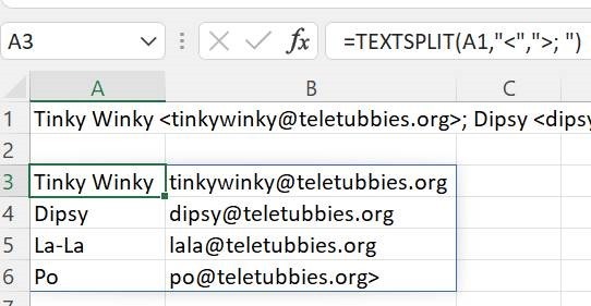
TEXTSPLIT functionSo, using TEXTSPLIT on our original pasted text from the email, using “<” as the delimiter for the columns and “>; “ as the marker for the end of each row, gives us a near perfect solution – the only clanger being the trailing “>” on the last address.

You could use another formula to find and strip out any left-over characters like that, or just manually delete the last “>” off the original line you pasted in.

You decide.

625 – Journaling now and then

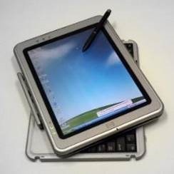
Compaq Tablet PCMemoirs and autobiographies are the top selling non-fiction books for good reason, as people like to recall past events through the words and thoughts of someone who was there, in the room or even in the driving seat. World leaders who write their tell-all book on what happened 20+ years ago, better have great memories or perhaps a trove of notes and diary entries from the time. If they are fans of journaling, they would have of-the-moment musings, written down to help clear their minds at the time – on committing thoughts to her diary, Anne Frank wrote, “I can shake off everything as I write; my sorrows disappear, my courage is reborn.”

Turning to technology and looking back to relatively near-term history brings up all kinds of product that was ahead of its time or was ultimately overtaken by other developments that nobody saw coming. Sometimes, the perfect blend of genius, timing, execution and luck combines and creates a durable and wildly successful category – like the Smartphone and the plethora of services and apps that were created.

Inversely, one of those tech innovations that was just a bit ahead of its time was the Tablet PC; a fully-functional Windows PC that was blessed with a pen and touch screen so you could take notes by hand just like on paper, yet by flipping it around it could be used to run Office apps and all the other stuff you’d need a PC for, 20 years ago.

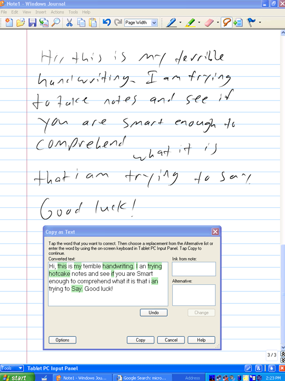
Windows Journal appIn hindsight, the idea of the Tablet PC was 10-15 years ahead of the technology that was needed to really make it work – the pen and screen digitizer were a bit too low-res; the processing power and memory was not up to the mark of providing the kind of user experience that the vision hoped for. The battery life was too poor while the whole thing was too heavy. Nowadays, with devices like the Surface Go and the iPad Pro, the reality is much closer – even if the dream of writing meeting notes by hand has been made somewhat obsolete by transcription and the fact that fewer people use a pen to write any more.

One new app that was built for the Tablet PC to take advantage of its pen, was Windows Journal, a relatively simple yet effective note-taking app, with surprisingly good handwriting recognition built in.

To read more from someone who was in the room – figuratively and, at times, literally – around the time of Tablet PC, the Journal software and the Office app originally called Scribbler which went on to become OneNote, check out Steven Sinofsky’s Hardcore Software post. It’s a fairly long but fascinating read.

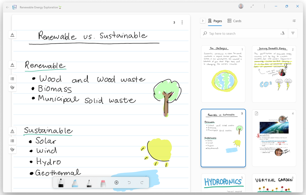
Using pen and paper for taking meeting notes might be less popular now, but many of us will still jot down reminders or lists on Post-it notes, perhaps doodling on paper to help creativity and flow. If you have a pen-capable computer now, the newly released Microsoft Journal app is worth a look.


Billed as an app for digital ink enthusiasts, this new Journal presents a modern take on the original Windows Journal idea – an infinitely scrollable canvas for jotting down anything, though with AI capabilities in the app providing quiet yet powerful functionality. Journal started as a research project (from the “Garage”), but has now graduated into a fully-fledged, supported app. Read more about it here.

Microsoft Journal appMaybe time to take a leaf from erstwhile storyteller Steve Clayton’s Friday Thing, and spend a few minutes every day handwriting a journal. Now where did I put that pen?

624 – Present in Teams, like a Boss

Present in TeamsEven after 2 years of mostly enforced remote meetings, it’s still amazing how many people have yet to master some of the basics of online meetings – like management of the mute button and general audio interference, positioning of screen/camera so you’re not looking up their nose or side of their face, professing to having bandwidth issues as the reason for not enabling video, and many more. One “room for improvement” function is that of presenting PowerPoint slides and not looking like an idiot.

Meet Now buttonFirstly, have a practice with Teams if you’re not sure how things are going to work out – just go to the Calendar tile and you’ll see a Meet now option in the top right; that creates a new instant meeting in which you can play.

Don’t share your screen to present slides in PowerPresent in Teams bannerPoint (unless you really insist). Instead, save your PowerPoint to OneDrive for Business or SharePoint, and you’ll see a Present in Teams button in the top right, or a larger button on the Slide Show tab.

Choosing this opens up a Presenter View akin to the one in PowerPoint, which is the default if you have multiple monitors and you start a Slide Show. This view lets you see Speaker Notes, jump quickly to specific slides rather than paging through them, and be more interactive with the meeting than you could ever be if you were simply sharing a screen showing a PowerPoint slide on your computer.

Show People or Chat panesPerhaps the most useful aspect of this mode in Teams is that you can still show the Chat or People pane to the side of the window – allowing you to keep an eye on attendees who might have their hands raised, or who ask questions in the meeting chat.

Presenter View

Lock content to current slideThere are some other controls of note – the eye icon  lets you decide if attendees can flick through your slides or whether you want to lock them to seeing only the slide you’re currently presenting. Useful if you have a Big Reveal coming at the end.

Next to that icon, there are some others which define the presenter mode – Content Only on the left, shows just the slide you want. Next to that is Standout, which takes your video and overlays it onto the slide rather than having it appear as one of the surrounding galleryStandout mode of other attendees. And next to that is a new preview PowerPoint feature called Cameo, which integrates with the Teams Client.

A downside of the Standout mode is that you don’t get to control where your image goes on screen, or how big it is – so you might well obliterate some part of the content you’re presenting. This new feature gives you a way to solve that.

Cameo button

In PowerPoint, go to the Insert tab and on each slide add a Cameo (or a Camera as the object it creates is described in some controls), then place and size it as you want.

If you select the new object, the Camera tab will give you more customization options.

Cameo Mode in useUse the Camera Styles gallery to pick from a shape and border/shadow combination, though the Camera Shape menu offers other variants to enhance your impact.

You will need to add a Cameo to every slide you want to show up on – potentially useful if you want to only appear for intros and Q&A but perhaps leave the content on its own for other parts.

Camera optionsSince each slide has its own Camera object, they can be of different shapes and you can even use the groovy Morph animation effect to transition too.

Laser pointer and ink controlsWhile in Presenter view, try using a “laser pointer” to temporarily show traces around something on your slide, with mouse or Surface pen to control it. There is a pen or highlighter to make more durable Ink markups, and if you double-click/tap each icon, you can set options like size, colour, adding arrow tips etc.

Hide presenter viewOne downside of the Presenter View is that it shrinks the content on your own screen to the point of possibly making it difficult to read, especially if you’re showing the People or Chat pane as well – in fact, the content is only about 20% of your screen real estate.

Using Pop Out might help if you have a larger second screen connected, though chances are you’ll be using the camera on a laptop so ideally want to be looking at that display.

Since nobody really uses Speaker Notes anyway, you could try Hide presenter view, which means you’ll lose the slide thumbnails and speaker notes, but still keep the other controls. Go to the View control on the top left of the window and choose Full Screen to increase it even more.

For more details on using the new Cameo feature, see here – it is in preview which is rolling out through Office Insiders first so you may not see it right away. If you are presenting using simple app or desktop sharing rather than the PowerPoint Live model described above, there are some other options in how you appear alongside your content.

As well as launching the PowerPoint Live sharing from within PPT itself, you can choose to share recent presentations while in Teams – just scroll down past the various “share screen / app” options and you’ll see more. This topic was covered previously on ToW #576.

623 – What’s .new pussycat?

clip_image002Many products evolve due to exposure to their competitors – adopting and refining the best features, and sometimes that evolution even starts to overtake the original. Many traditional desktop applications moved to online variants or were supplanted by newer concepts, such as shifting to mobile apps. Experiences that were clunky – like banking – moved to sometimes lower-functionality but more convenient apps, just as consumers adopted mobile payments and contactless cards.

Having blazed a trail with email in Hotmail and later Outlook Web Access, in 2010 Microsoft launched the first version of the Office web applications, meaning you could run lightweight Word, Excel and PowerPoint in your browser, as a companion or even as an alternative to the full-fat desktop versions.

A few years earlier, Google Docs released as an online word processor (and later, other types of productivity apps, rebranding as G Suite and now Google Workspace). There are pros and cons of the browser-only experience; you tend to sacrifice some functionality compared to the desktop applications in favour of ubiquitous availability, though web clients can be updated more easily and sometimes new features appear there first – as ToW #605 covered, with snoozing email.

Check out What’s new in Excel for the web or look for the summary covering Visio, Forms, Words and more, here.

clip_image004Not sure about living in a browser? Modern-living afficionados can get by, using only web apps like Outlook, OneNote, To-Do and more.

If you like being browser based rather than desktop boundclip_image006, you could start a new document from the address bar by simply entering word.new, excel.new or powerpoint.new. Others include docx.new, ppt.new, teams.new, sway.new

clip_image008You could add such links to your browser favourites; therefore, a new doc is but a single click away.  There are many more .new shortcuts – Google’s in-house domain registry launched the service a few years ago, so not unsurprisingly, Mountain View hoovered up a lot of the relevant ones if you’re of a Googly persuasion. See docs.new, sheets.new or slides.new, mail.new

618 – Listing

clip_image002Lists form a big part of lots of peoples’ lives – whether it’s a to-do list for productivity afficionados, shopping lists for remembering the essentials or compiling top-five lists of favourite things, just, well, because.

A while back, Microsoft released a new app for Microsoft 365 users called Lists, which was essentially a front-end to SharePoint, itself a staple of the Office 365/Microsoft 365 offering since the beginning, and providing much more functionality than simply a place to stuff documents. The original SharePoint Portal Server 2001 (codenamed “Tahoe”) is nearly old enough to buy itself a beer in its homeland, and relatively advanced logic and custom data validation & handling has been a major part of its appeal for a lot of that time.

clip_image004Lists brings a lot of that functionality to the fore, while being extensible through Power Apps and integrated into Teams. There are mobile Lists apps available and in beta too.

Recently, the Lists experience was made available – in preview – for non-M365 users who could sign in with their Microsoft Account. A “lightweight” version of the app, it’s still pretty functional and pitched at individuals, families or small businesses who need to keep lists of things.

Taking a slightly different tack, the To Do application is a good way of making other sorts of lists – that could be Tasks or flagged emails as well as simple tick-lists to mark off what needs to be done. In something of an overlap with Lists, To Do can share its lists with other people – think of To Do as primarily for personal use that you might share, whereas Lists is for managing shared endeavours first and foremost.

clip_image008If you’re a user of both Amazon’s Alexa services and Microsoft To Do, you might want to integrate them together; using the Tasks In The Hand skill. Once enabled and correctly configured, you can use Alexa to manage that service’s built-in To-Do and Shopping lists, and these are then synchronized to the Microsoft To Do app.

clip_image010You can rename the lists which are subsequently created in To Do and which sync with Alexa, though you can’t yet manage additional ones. You could simply use the Alexa app to manage the lists rather than synching them with To Do, but setting up synch gives you more flexibility – To Do integrates with other software and services, like being able to show lists in the Microsoft Launcher app on an Android phone.