|
Estimates of the energy cost to transmit and store data vary wildly, but if 1 GB cost 1 kWh power and the average CO2 output for generation was ~500g/kWh, then even shaving 10MB off a file can make a material difference if it’s going to be heavily used†. There are a few tricks you can follow to make your PPTs less massive – like compressing the images within, meaning that an embedded picture which was originally sized to print on a poster could be re-sized to fit on a screen.
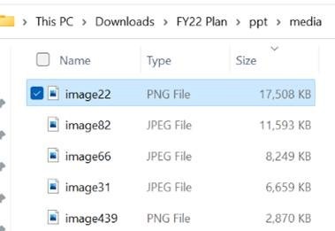
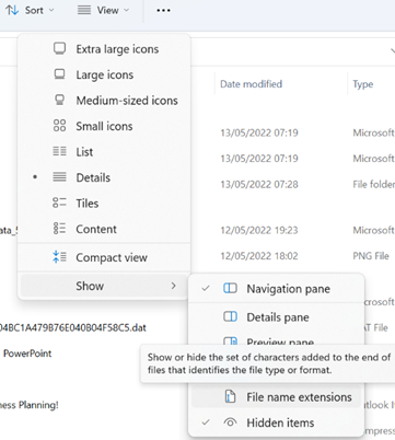
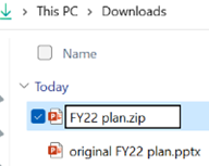
A somewhat cavalier way of looking for large things you can torch, is to make a copy of your PPTX file and then rename it so you can look within. The OfficeXML file formats (prevalent in Office 2007 and onwards) use the same compression as ZIP files, so if you rename your file as such, you’ll be able to open it in Windows Explorer or other ZIP handling utilities, to see its innards. Opening the file shows you a folder structure, and if you navigate into ppt \ media then sort by Size, you’ll quickly see what’s making your file so big.
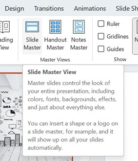
Go into View menu and look under Slide Master, which will open a whole new tab specific to the management of these template slides that form the bones of the presentation. You may well see lots of title slides or similar, which have embedded background images – if you know you don’t need those graphics or those layouts, just delete them.
This title slide in the Slide Master view had a graphical background which was 17Mb in size
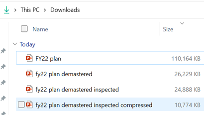
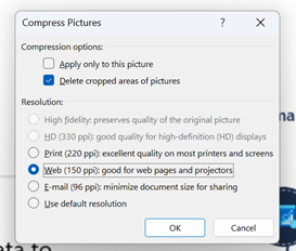
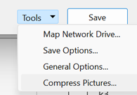
Selecting an image from one of the 70-odd slides in the deck, and choosing Compress Pictures from the Picture Format tab reduced it again to only 11MB, or 10% of the original file size – all for a few minutes’ effort.
†NB: the irony of sending a 2MB email to thousands of people, and sharing online and on LinkedIn, is not lost. |
Tag: data
597 – Pivot table filtering
|
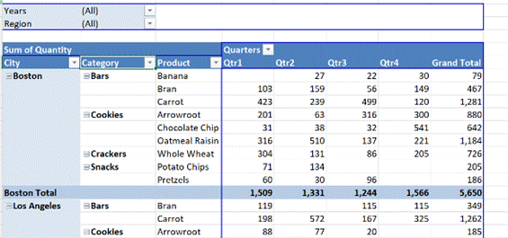
Excel makes it easy to take a static table with rows of data arranged into columns that correspond to measures or fields – like sales of a product, or assignments of a relationship such as an export from a CRM system – and then represent the inherent hierarchy in a super-powerful fashion. If you haven’t really used Pivot Tables, the simplest way to get your head around what they can do is to try messing around with some real data, or use some relatively simple sample data to unearth the power within. Free sample data at Contextures is a good place to start – in fact, here’s one sample that has been turned into a Pivot table to get started with (just download it somewhere, open the Zip file and then open the example XLSX file within).
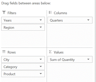
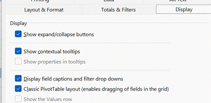
By showing the PivotTable field list (right-click on the table and you’ll see either show or hide field list at the bottom of the menu), you can easily drag things around to change the grouping order.
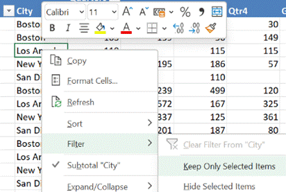
In our foodstuff example, we could have a different layout of fields and want to filter on City – but a quicker way to doing so is to just right-click on the name you want to focus on, and choose Filter > Keep Only Selected Items and it will quickly set the filter to just that name. |
Tip o’ the Week 485 – Excel and the Web
|
A recent tweet from @msexcel showed a simple video on how to grab data from a website – highlighting a capability that’s been in Excel for years but has been refreshed and made a lot easier to use.
Once you’ve tagged the source data, clicking on the icon to the left of the data point will show a pop up with the background detail, or you can reference the fields within formulae to display or manipulate the data values.
See more detail on using the Stock quotes functionality, here. |

