642 – Finding work stuff

Data storage has become very cheap over the decades – a while ago, ComputerWorld wrote an article, saying that when it was founded 50 years previous, a 1MB hard disk would cost you $1M, and in 2017, that would work out at $0.02. 5 years later, $0.02 would get >1GB, more than 1,000 times as much.

clip_image002[4]This profusion has turned many of us into pilers – what’s the point of organizing data and deleting old stuff, be that files, emails, camera roll photos?

Outlook has a pretty good search function built in. OneDrive photos has some great organizing and filtering capabilities (like On This Day, or if you have GPS enabled on your camera/phone, you can easily group photos by the location taken from).

clip_image004[4]Still in OneDrive, there is also some AI-based tagging of your pics, which can sometimes be a bit hit & miss… but more often than not gets it about right.

While browsing “All Photos”, if you mouse-over to the right, you’ll get a scrollable timeline too (similar to the Windows Photos app), so you can quickly jump to a reference date.

Assuming you’re using Microsoft 365 / Office 365 at your workplace, there are other ways to find stuff that is more work-related, like documents, email and messages. One easily overlooked source is the “new tab” experience within the Edge browser.

clip_image006[4]The content on the default home page can be customized in a variety of ways, from choosing whether to show a background image or keep it clear; to displaying content from various “news” providers and clickbait advertisers that Microsoft News / MSN has elected to present to you, or hiding that altogether.

You can do some filtering of that content too, though for work purposes, many people may want to leave the page layout in “Focused”, which puts a link bar at the bottom and hides the content to be a scroll away.

Edge Profiling

If you have a “Work” profile (or you only have a single profile) and it is connected to your work account – ie your Microsoft 365/ Office 365 email address rather than your personal one – then you’ll see a “Microsoft 365” link within the list of content providers, which gives you a simple view of your most recent documents, SharePoint sites you visit and a whole lot more. To learn more about this Edge Enterprise tab, see here.

clip_image008[4]

Also, you’ll see the search box containing your company name – it uses Bing to search for whatever you put in there (somewhat controversially, regardless of what your default search engine in the browser is…). Edge doesn’t give you the option – like IE used to – of starting a tab with a completely blank page, though there are hacks to make that work.

clip_image010[4]If you stick with the standard new tab, it will also give you the choice of restricting your search to “Work”, so looking at documents and the likes. You’ll see a list of content sources clip_image012[4]displayed on the left side as tabs, allowing you to filter what you’re looking for or where you want to search.

There’s a fairly new one that searches “Messages”. At least for now, that means Outlook and / or Teams messages, but it could be really useful when trying to remember if a conversation you had was in email or in a Teams chat.

A quick way to jump to this section is to go to aka.ms/messages

– regardless of which browser you’re using, as it uses the Bing.com/work back end.

633 – Muting in Teams

clip_image002You’re on mute” became a catchphrase of 2020, even featuring in London’s New Year firework & drone display at the outset of 2021. A year later, Lake Superior State University added it their list of phrases that should be banned from the lexicon, along with “Deep Dive”, “Circle Back” and “New Normal”. Pioneer even sent aloft a loudspeaker saying “You’re on Mute” in several languages, symbolically firing it into space for good (though it went up as far as 30km, it did come back down again and space nerds will know that actual “space” isn’t regarded as starting until 100km from the Earth’s surface).

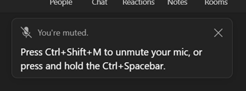
clip_image004Some functional improvements in Teams have been released to help manage the state of being muted/unmuted; the applications can even recognise that you’ve started talking but your mic is off and will remind you of the shortcuts to switch it on again.

clip_image006CTRL+Space is particularly useful if you just want to chip in a short comment on a call where most people are muted, rather than fishing around to click on the Mic icon within the meeting. Press and hold to talk and release to go back to being quiet.

We’ve all been in Teams meetings when someone has left themselves unmuted and presumably doesn’t realise – they start talking to someone else in their house / dog barks / they start eating a bag of crisps / sighing noisily etc. Social etiquette will often have the speaker ask, “Oh, does someone have a question?” or the slightly more direct instruction to mute yourself unless you want to talk.

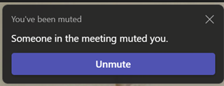
clip_image008By looking in the People pane to the side of the Teams meeting window, you can see who is making noise as their icon will have a halo around it. If you are the clip_image010organiser or have been given Presenter abilities (as is often the default), then you’ll be able to silence the heavy breathers and furious typists by right-clicking their icon and muting them.  It may be slightly passive-aggressive, but the offender gets notified and hopefully will feel a good sense of righteous shame. Unless they’re actually the current presenter, and someone else has pranked them by muting them in mid-flow.

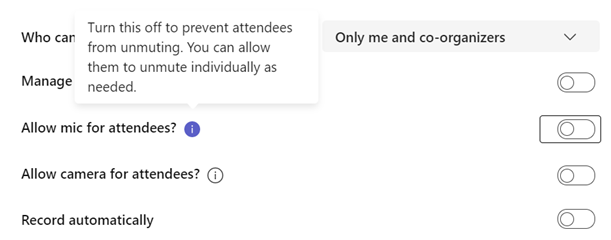
clip_image012There are some other controls aimed at making online meetings less rowdy affairs, by giving the organiser the power to control who gets to speak or show their camera in the first place.

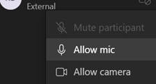
Bear in mind that it only applies to “Attendees” (ie all “Presenters” can choose to make their mic / camera available any time) and by right-clicking on an attendee’s icon in the Participants list, an clip_image014organiser can allow the Mic / Camera to be enabled for that user; note it doesn’t take them off mute, it just gives them the ability to unmute themselves. Just Imagine the horror if an organiser could switch on another attendee’s camera and mic without their involvement.

As we increasingly go back to hybrid meetings where remote participants will join a meeting room full of meatbags, it’s important once more to manage the microphone / speaker dance when several people in the same space join the same meeting. One best practice is to have people in the room log in to the online the meeting too, and potentially use the raise hand feature in Teams before they are asked by the organiser to talk, that way putting them on an equal footing with remote participants. But this will be bad news if those physical attendees don’t fix their laptop audio properly.

clip_image016If you have multiple people in one place who have their mics and speakers on, you’ll have the bad kind of feedback loop, with escalating echo. You could get them all to mute their mics, but the main meeting room microphone will pick up the sound of their speakers too, with the same effect; so in-room attendees need to mute both speakers & mic.

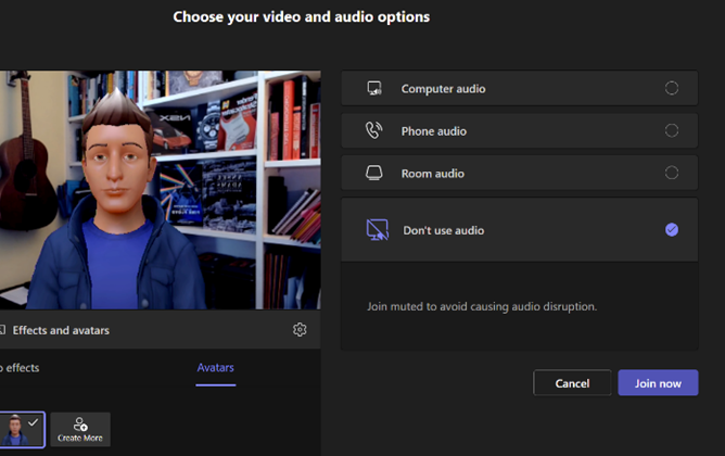
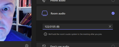
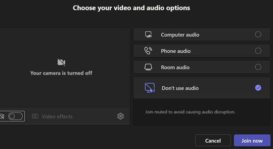
Pay attention to the “yeah, yeah” video and audio dialog that most people will rush through when joining a Teams meeting; there’s a “Don’t use audio” feature which means you’ll join and have no worry about your own laptop causing problems in the meeting room.

If you have a Teams Room system, you might want to join with no video too or you’ll end up with a gallery of attendees who are facing away from their camera, as they look at other people in the physical meeting room.

624 – Present in Teams, like a Boss

Present in TeamsEven after 2 years of mostly enforced remote meetings, it’s still amazing how many people have yet to master some of the basics of online meetings – like management of the mute button and general audio interference, positioning of screen/camera so you’re not looking up their nose or side of their face, professing to having bandwidth issues as the reason for not enabling video, and many more. One “room for improvement” function is that of presenting PowerPoint slides and not looking like an idiot.

Meet Now buttonFirstly, have a practice with Teams if you’re not sure how things are going to work out – just go to the Calendar tile and you’ll see a Meet now option in the top right; that creates a new instant meeting in which you can play.

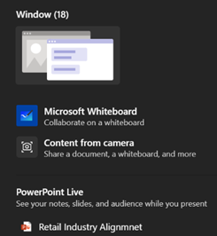
Don’t share your screen to present slides in PowerPresent in Teams bannerPoint (unless you really insist). Instead, save your PowerPoint to OneDrive for Business or SharePoint, and you’ll see a Present in Teams button in the top right, or a larger button on the Slide Show tab.

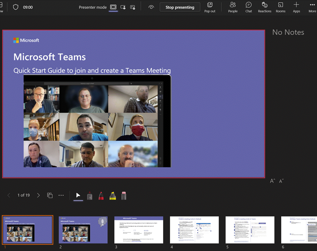
Choosing this opens up a Presenter View akin to the one in PowerPoint, which is the default if you have multiple monitors and you start a Slide Show. This view lets you see Speaker Notes, jump quickly to specific slides rather than paging through them, and be more interactive with the meeting than you could ever be if you were simply sharing a screen showing a PowerPoint slide on your computer.

Show People or Chat panesPerhaps the most useful aspect of this mode in Teams is that you can still show the Chat or People pane to the side of the window – allowing you to keep an eye on attendees who might have their hands raised, or who ask questions in the meeting chat.

Presenter View

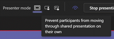
Lock content to current slideThere are some other controls of note – the eye icon  lets you decide if attendees can flick through your slides or whether you want to lock them to seeing only the slide you’re currently presenting. Useful if you have a Big Reveal coming at the end.

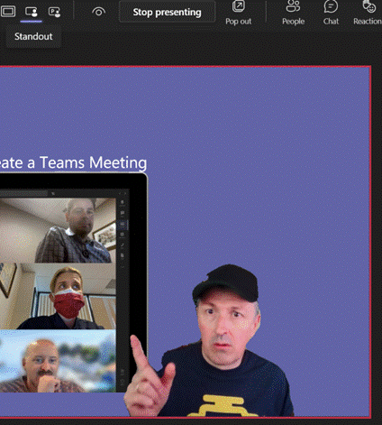
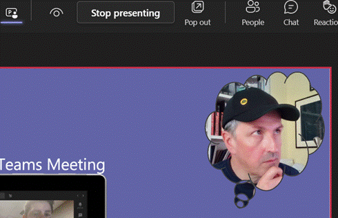
Next to that icon, there are some others which define the presenter mode – Content Only on the left, shows just the slide you want. Next to that is Standout, which takes your video and overlays it onto the slide rather than having it appear as one of the surrounding galleryStandout mode of other attendees. And next to that is a new preview PowerPoint feature called Cameo, which integrates with the Teams Client.

A downside of the Standout mode is that you don’t get to control where your image goes on screen, or how big it is – so you might well obliterate some part of the content you’re presenting. This new feature gives you a way to solve that.

Cameo button

In PowerPoint, go to the Insert tab and on each slide add a Cameo (or a Camera as the object it creates is described in some controls), then place and size it as you want.

If you select the new object, the Camera tab will give you more customization options.

Cameo Mode in useUse the Camera Styles gallery to pick from a shape and border/shadow combination, though the Camera Shape menu offers other variants to enhance your impact.

You will need to add a Cameo to every slide you want to show up on – potentially useful if you want to only appear for intros and Q&A but perhaps leave the content on its own for other parts.

Camera optionsSince each slide has its own Camera object, they can be of different shapes and you can even use the groovy Morph animation effect to transition too.

Laser pointer and ink controlsWhile in Presenter view, try using a “laser pointer” to temporarily show traces around something on your slide, with mouse or Surface pen to control it. There is a pen or highlighter to make more durable Ink markups, and if you double-click/tap each icon, you can set options like size, colour, adding arrow tips etc.

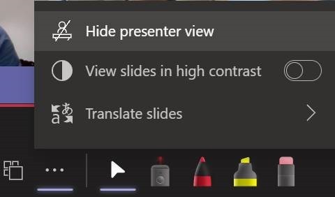
Hide presenter viewOne downside of the Presenter View is that it shrinks the content on your own screen to the point of possibly making it difficult to read, especially if you’re showing the People or Chat pane as well – in fact, the content is only about 20% of your screen real estate.

Using Pop Out might help if you have a larger second screen connected, though chances are you’ll be using the camera on a laptop so ideally want to be looking at that display.

Since nobody really uses Speaker Notes anyway, you could try Hide presenter view, which means you’ll lose the slide thumbnails and speaker notes, but still keep the other controls. Go to the View control on the top left of the window and choose Full Screen to increase it even more.

For more details on using the new Cameo feature, see here – it is in preview which is rolling out through Office Insiders first so you may not see it right away. If you are presenting using simple app or desktop sharing rather than the PowerPoint Live model described above, there are some other options in how you appear alongside your content.

As well as launching the PowerPoint Live sharing from within PPT itself, you can choose to share recent presentations while in Teams – just scroll down past the various “share screen / app” options and you’ll see more. This topic was covered previously on ToW #576.

621 – Working Time Directive

Analog watch with GMT handTime Zones have featured lots on ToW; in an epoch when everyone was holed up WFH, the relative time people were at became especially important when trying to meet with them. Sometimes, it’s unavoidable that meeting times are unpalatable to some attendees if they’re in a far-flung time zone, but it’s worth reminding yourself how distant they are when trying to find the best time slot to speak with them.

There are whole genres of mechanical watches which can display multiple time zones (check out GMT or World Time if horology is your thing), or you could rely on phone or computer-based aides-memoire, such as displaying multiple time zones alongside your calendar in Outlook, using the Windows Clock app with its world clock view, or even showing several clocks on the Windows task bar.

Teams contact card showing time zone infoA new addition to the arsenal of time zone tooling is a neat feature that’s appeared in the contact card in Teams and Outlook, showing you what the time is for the person you’re looking at. The time displayed is set by the device they’re using, so if on Windows, that’s the Time Zone setting.

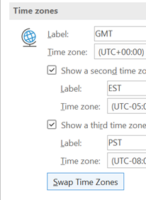
Outlook Time Zone optionsWhen travelling, rather than just manually winding the clock back or forward, it makes sense to set the correct time zone on your machine – either by allowing Windows to change it automatically or by specifically choosing it from the list.

If you have multiple time zones displayed in Outlook, you can switch between them from the settings page – just right-click on the timeline to the side of the calendar and choose Change Time Zone, or go to File | Options | Calendar and look for the settings in there.

When you swap them around inside Outlook, it will change the time zone on your PC.

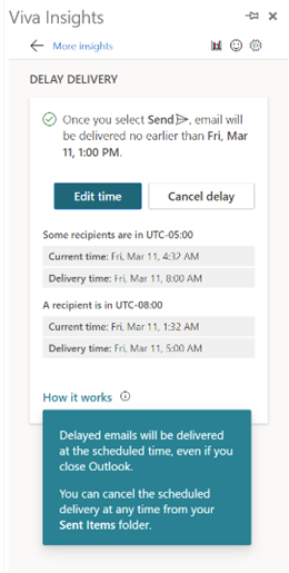
In some parts of the world, there’s pressure to prevent “work” from creeping into personal time, meaning emails and other messages should be held back and not Viva Insights delay deliverysent during what’s supposedly down-time. Ireland has published a “right to disconnect” code of practice, and Portugal even made it illegal for an employer to contact their workers outside of working hours.

If you’re using the right kind of Microsoft 365 subscription, Outlook can offer to delay emails you’re sending to people who are in different time zones – part of the Viva Insights package.

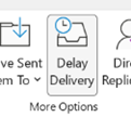
Choosing this action has a similar effect to the Delay Delivery Outlook's delay delivery optionoption which is visible on the Outlook toolbar, except that it won’t need Outlook to be running; the regular Delay feature leaves a message in your Outbox folder, and that normally means the Outlook client needs to be running at the time you want it to be sent.

The Viva-powered delay option holds the message on the server until the allotted hour, and then delivers it to the recipients – handy if the sender is already outside their working hours by that point

619 – Teams plays Pop

clip_image002Words evoke times and places for lots of people, and “Pop” certainly has plenty of associations and meanings. For some, it’s the (often cheaply-branded, sickly-sweet) fizzy drink of their youth (see also skoosh, in certain parts of the world), it might be forgettable teeny bop music or perhaps an intransitive verb used to describe how something stands out.

It’s also a familiar word used in annoying UX concepts like a pop-up in your browser, or a toast on your desktop. Applications often put out toolbars or separate content in side windows, to help users make the most of their functionality: especially handy when the user has more than one display.

In its evolution over the past couple of years of explosive user growth (270M MAU!), Microsoft Teams has started to move away from the one-window-to-rule-them-all idea of having all your chats, activities, documents etc in one place, and started offering to pop things out into their own window.

clip_image004

If you’re in a meeting and want to have a side channel going on with a subset of participants, just start a multi-party chat, then clip_image006right-click on it within the recent chats list, or from within the chat window itself. See more here. Other Teams apps also feature the top-right pop-out icon too.

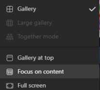
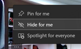
clip_image008As well as offering a variety of Gallery and focus views, including the ability to place where the gallery is displayed (if at all), there’s also been an addition to hide your own clip_image010camera preview, in case you find yourself distractedly checking yourself out during meetings.

You could therefore dismiss all the other sidebars – like chat, or participants list – make the gallery go away, focus on presented content in full screen and hide your own preview – all in the name of being able to see what someone else is sharing.

clip_image012There is probably more popping still to come. There is a public preview for Teams – which can be enabled by your Microsoft 365 Admin, here – and that enables the early stages of some new features which are being tested. Microsoft has its own internal test programs too.

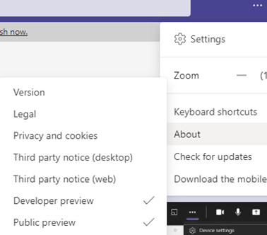
Once the preview-enabling policy has been applied by Admin, then individual users will have the option (from the … / About menu) to enrol their machine in the preview; after doing so, signing out & in again, and a “Check for updates” cycle should see them have the latest available preview version.

The holy grail for popping out in Teams meetings would be the ability to separate the content being shared so you could have that on one screen, and see a large video gallery of attendees, with chat sidebars etc on another. 

clip_image014Some day. Maybe.

In the meantime, keep an eye on what’s new in the main branch of Teams, by looking on the Teams blog.

613 – Ready for your close-up?

clip_image002
Firstly, a call out to regular reader @Nick Lines, who pointed out a typo in an infographic in last week’s ToW; said image was pinched from another online source without taking the opporunity to correct it.

Outlook made some helpful suggestions in response – just one example of new AI functionality showing up by dint of subscription services.

clip_image004

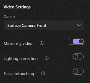
clip_image006Another case in point where software gets better on a regular basis, is a slew of new features that have appeared for some Teams users – namely, the ability to tweak your own camera image. If you don’t see them yet, try checking for updates from the … menu to the left of your own profile image in the main Teams window.

Mirroring your video makes it easier to interact with your own environment while you’re looking at the screen, though it doesn’t affect what others in the meeting see.

Lighting Correction is a one-setting tweak for fixing the contrast and brightness, which can be handy when it’s dark outside and your room lighting isn’t ideal.

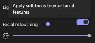
clip_image008Most entertaining though, is the facial retouching feature – YMMV depending on how much your fizzog need retouching in the first place, possibly. You can apply a dab of filler all the way up to full-blown Insta-influencer soft focus, by enabling the feature then moving the slider. Look under Device Settings from the ellipsis (…) menu when you’re in a call.

clip_image010The results speak for themselves… clip_image012

Check out the Teams blog, and look forward to lots more new features arriving later in the year.

Another tweak in managing your own video comes from users’ feedback, where they don’t want to see their own video window, thinking that it’s distracting when looking at a gallery of other attendees in a meeting.

clip_image014You’ll be able to hide your own video by clicking on the … in the corner of your own preview, and can then selectively show or hide, or if you’re especially vain, you can pin your own tile to the meeting view so you show up as the same size as everyone else.

Perfect for checking out how the facial buffing has worked out.

607 – How’s you call health?

clip_image002When the pandemic first hit, many people realised that fast, reliable home broadband was an essential utility rather than a nice-to-have. With potentially more people in the house sharing the connection all day, streaming video and doing online meetings, contention in the domestic environment became something of an issue, where one user can hog the available bandwidth to the detriment of others.

The same issue occurs en masse at the broadband provider’s network, where their resources are shared between users on the assumption that they won’t see all of them demanding full speed at the same time: a contention ratio of 50:1 is pretty common, meaning if your neighbours are hammering their connection then it may affect you (assuming you’re on the same provider).

clip_image004By now, we should all be used to the challenge of making your home network better – plugging into a wired network port to avoid poor WiFi signal, making sure other devices don’t do massive downloads during the working day. Check the speed of your network using one of the many tools available – like this one from Microsoft Research; if you search on Bing.com for just speed test then you’ll get a simple speedometer view.

If you’re using Teams or other realtime conferencing tools, it’s arguably more important to look at the latency (or “ping”) and the upload speed, than focussing on the headline download speed; if you have a device uploading lots of data, it might rob your bandwidth and ramp up the latency, which will be the enemy of any kind of synchronous comms. Check your latency over time with an online tool (like TestMy Latency) or download WinMTR to look for spikes in latency.

It’s worth making sure your PC isn’t causing issues itself, by running out of memory or pegging out the CPU and therefore giving a poor experience: the topic of looking for poor home network perf has been covered previously in ToW #533 amongst others.

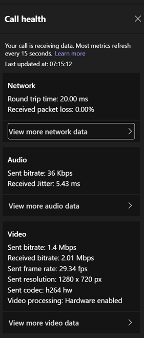
clip_image006clip_image008Microsoft Teams has added some built-in monitoring and data collection capabilities, reported back to a central admin dashboard (Set up Call Quality Dashboard (CQD), and now semi-realtime data is visible in the Teams client itself. 

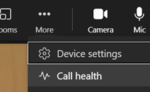
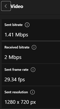
clip_image010When in a call, go to the menu and look for Call health. Click on the various “view more… data >” buttons to see further detail, like the size and rate of the video you’re sending to the call you’re currently on. If your colleagues tell you that the quality of your video is poor, take a look in there to see what you’re actually sending.

As an end user, see here to understand how to interpret the various data. Hover over the little info icons to the side of each headline to see a bubble explaining in one-line what this is measuring. It’s quite interesting.

For admin guidance on what bandwidth and latency requirements you should have to perform acceptably, see here.

602 – re-drawing Whiteboard

clip_image002One thing we all miss about having physical team meetings, is the delight of trying to read an enthusiastic participant’s attempt at getting their thought process across by scribbling on a whiteboard. Often with pens that have too little ink left to be legible. Charts with arrows always point up and left and bullet-point, capitalized text that may just be readable, but can anyone remember what it meant by the end of the meeting? At least you can take a picture to decipher later.

Fortunately, there are digital equivalences – you could be in a Teams meeting and co-authoring a document, where multiple people are editing at the same time and marking up comments. You could be watching someone share their 4K screen so they can walk through only a few dozen PowerPoint slides, or you might even have had a play with the shared Whiteboard app that’s been around and been part of Teams for a while now.

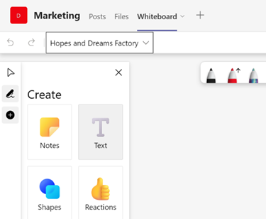
clip_image004Well, the Whiteboard has had some pretty major updates recently.

The whole UI has been given an overhaul in line with the latest colourful design ethos, and there are lots of neat new features like the automatic shape recognition for mouse-driven drawing. Hold the Shift key down while you’re drawing with a mouse pointer or a Surface pen, and it’ll straighten lines for you.

It’s available in a variety of guises; there’s a web UI (app.whiteboard.microsoft.com) and it shows up in the menu on the top left of Office 365 web applications, such as subscribers would find by going to office.com and signing in with your ID. It’s on iOS and Android, though updates may flow through at different rates to other platforms.

clip_image006Of course, it’s as a Microsoft Store app too; if you’re already a Windows 11 user, you may want to check out the new Store and look for the Library icon on the lower left, showing you what you’ve installed previously and also which apps have been most recently updated (and am Update button to kick off that process). Sadly, looking at an app’s page in the Store (still) doesn’t tell you what the current version is or when it was last updated.

clip_image008To start Whiteboard in a Teams meeting, just go to the Share menu and look for the clip_image010Whiteboard option, just under the part where you’d share your whole screen or individual window.

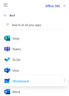
You can pin whiteboards to Teams channels or chats too; just add a Tab, select Whiteboard from the app list, and the content will persist within that context rather than a point-in-time meeting.

596 – Sorry for the eye-chart

clip_image002Before The Event, you’ll probably recall being presented at in a stuffy airless room, mainlining caffeine to stave off the postprandial doldrums in attentiveness. “On this slide…”, the presenter might have said, before reading out all the text that’s now being shown on a slightly-too-small screen.

Some would apologize for the fact that the chart/table of data/timeline with 6pt text annotations etc, was too small for the audience to read. “I know this is an eye chart, but…”

So hurray when all such in-person meetings were banished to Teams or Zoom if you’re lucky, or if you’ve been a horrible person in a previous life, you may have inflicted upon you Webex, Amazon Chime or whatever Google calls Hangouts these days.

When presenting in Teams, there are some simple best practices to follow; some have been covered previously in ToW 576, with more online elsewhere.

clip_image004As an attendee, however, the Teams UI can get a bit busy if you want to follow online chat and see other attendees as well as the content being presented. You can make life a bit easier by going full-screen, from the view control in the top left.

As well as tweaking the layout, and hiding/showing components like chat or the participant list, you can zoom the Teams client in and out by using CTRL = and CTRL – (or CTRL + / – on your numeric keypad if you have one), or by holding CTRL and moving the mouse wheel up and down, if you have a suitably-equipped rodent connected. This method, however, just makes the Teams UI get bigger and smaller, so although it might increase the size of the pane being used to present content, it is a marginal gain.

clip_image006Enter, a greatly useful tip espoused by Belgian usability maestro, Ingmar Boon – click on the content being shown in a meeting, then use CTRL+mousewheel (or if you have a Surface device and the touchpad is enabled then use the pinch in & out gesture on the touchpad). Teams will now let you zoom in & out and pan around the content being shared. C’est manifique!

594 – One day, meetings != Teams

clip_image001Over the last 18 months, the number of Teams users has shot up – over 250M according to latest published stats, or almost 20x what they were 2 years ago. We all know why.

When you create an appointment in Outlook and decide to turn it into a Teams meeting by clicking the icon on the clip_image003Meeting tab, a bunch of custom fields are added to the meeting item in your calendar to define how it should be handled by the Outlook application, clip_image005allowing such functionality as right-clicking on an item in your calendar and joining the meeting from there.

Then there’s the text that gets added to the end of any existing appointment text, which gives dial-in info and provides a link for users who like to click on URLs or who are running a calendaring client which doesn’t support Teams natively. Some degree of customization can be done to this auto-text, but it’s an admin task rather than an end-user one.

clip_image007LinkedIn’s #1 fan, Brian Galicia, got in touch to draw attention to an option in Outlook which lets you make every meeting a Teams meeting (since the days of meeting people face to face now feel like a distant memory). Fortunately, it only adds the appendages to a calendar appointment when you start to invite people to it, so if you put stuff in your calendar to remind you to do things In Real Life, it won’t get in the way.

The option is accessed from the main Outlook window, under File | Options | Calendar, and is just above the groovy feature which lets you choose to shorten the default meeting time, so as to allow you and the attendees to get out of your chair once or twice in a working day.

From the ToW history files: When you create a thing in your calendar that’s just for you, that’s an Appointment. When you start to invite other people to your thing, then it becomes a Meeting. The Outlook UI changes when you’re dealing with Meetings vs Appointments (e.g., see tracking information on who accepted your meeting invitation, etc).

When the Teams integration to Outlook was first rolled out, the workflow to create a meeting was typically to put the time in your diary, invite your desired attendees, then click the Teams Meeting button to add all the extra stuff that anoints the meeting to become a Teams one.

That was a one-way process, though – if you clicked in error or decided to forego the online element, you either had to hack out the properties and text (since merely removing the “join” links in the text didn’t get rid of the Join Meeting UI in Outlook, as that was lit up by the contents of the various custom fields in the item) or, more likely, ditch the meeting and create a new one.

clip_image009Happily, Outlook now lets you do the removal from within its UI. You’ll find that under Settings on the Meeting tab, where you can also control some other functions, like whether external attendees need to be held in the lobby or whether you let them straight in.

The bypass feature is meeting-specific, so if you are scheduling 1:1s with customers or partners, you might want to let the striaght through, but if hosting a larger meeting then having a lobby could let you get your internal team straight before bringing in your guests.