We’re all busy. Who has time to watch training videos, recordings of online conferences and the like, without skipping the blah blah and getting to the point?
What if we could use cutting edge technology to give us more time to do the things we really want to be doing?
Some online videos have a transcript already published – on YouTube, for example, it’s an option hidden in the description, if the publisher allows it. Clicking the Show transcript button will then display a text stream of what was said, with timestamps alongside.

It’s not searchable, other than by using the browser to try and find text on the page. In the case of YouTube, though, it’s a handy way of jumping straight to a keyword in the video.

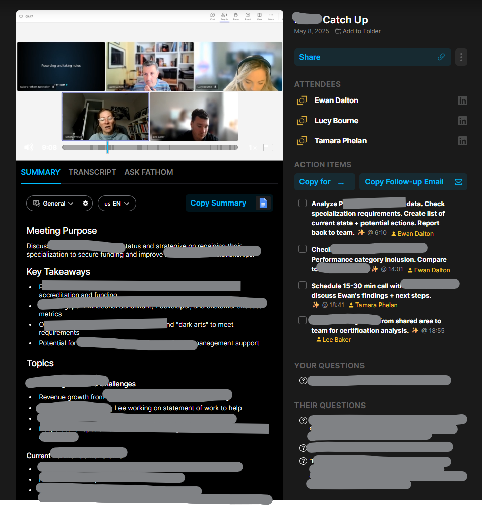
If you can get the transcription, you can get it summarised. Why bother wading through hours of corporate chiff-chaff if you could get the tasty bullets extracted for you?
But that’s not what we want.
Take One – the live video
Live broadcasts don’t publish the transcript; clearly, they can’t know what is going to be said and when. Maybe they’ll have live subtitling but that’s tricky to do anything with until after the event is over.
“As live” stuff like corporate events such as Microsoft’s recent MCAPS Start for Partners often don’t make the transcript available ahead of time. Watching these kinds of things in real time, there is one natty technique to get a transcript, even though it does have some shortcomings.
Using Teams, go to the Calendar view and start a new instant meeting…

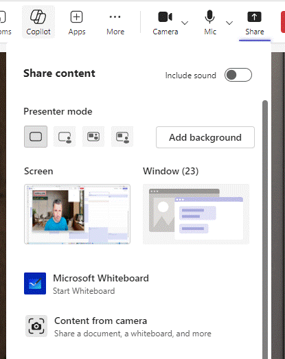
Once joined, you’ll be the only participant and also the meeting organiser. Now Share the browser tab that is displaying the live video with your meeting; share just the window and make sure you’re including sound (so the sound from the window is getting picked up by Teams).

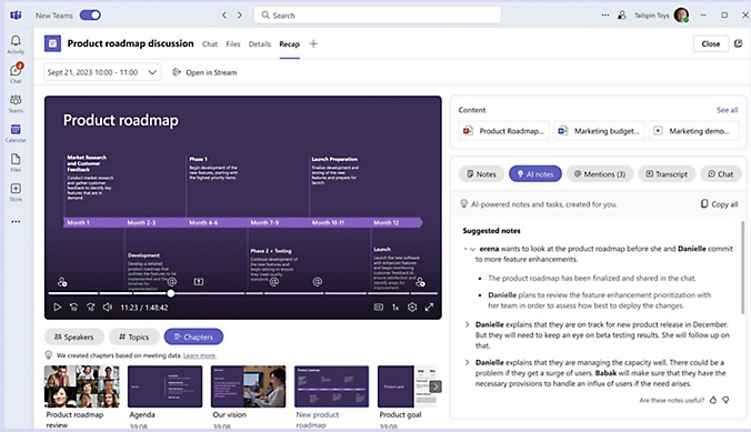
Now, you’ll be able to Start transcription and Teams will record everything that’s being said.

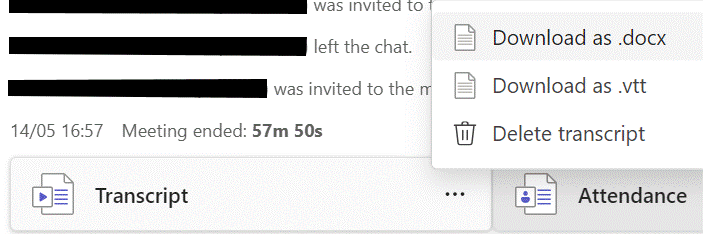
The downside is that everything is noted as coming from you (since it won’t know who is speaking in the real video) and some jargon might be messed up repeatedly. When the meeting is finished, you should be able to look at the Recap feature and locate the transcript.
Download the text to a Word doc and you’ll be able to do some simple editing like find/replace for common mistakes (in the MCAPS event, “FY20 6” cropped up instead of FY26, or “SME and C” instead of SME&C), and maybe even add in the names of speakers at different points if you know them.
The transcript can be fed to your favourite AI tool later to summarise it. More on that later.
Take Two – the replay of video
Other training vids etc might be published on-demand, and if they avoid sharing a transcript too, it’s still possible to use the same technique as above to capture what’s being said. You might even be able to alter the playback speed so you can capture the text without investing the actual time to watch the video …

Chances are that 4x playback will be a bit too fast for the transcriber to catch its gist. Stick to 1.5 – 2x and marvel at your own genius.
Take Three – they published the transcript!
Oh, frabjous day! If your video of choice does have a published transcription, it’s likely that it will have correct speaker names, and the creator may have tidied up any mistakes in capturing jargon or abbreviations.
In the case of the Microsoft MCAPS Start event referenced earlier, they did share the transcript as a .VTT file, a format used to define subtitle displays so it’s very chopped up and has timeline information too. Not easy to read, particularly, but we can overcome that.

Click the … option on the control bar and you may see Transcript options; in this case, you can search for a keyword and jump directly to that point in the video, or click the little arrow to download a copy to a VTT file. It’s just a text file that can be opened in Word or Notepad if you insist; it would be worth saving it to your PC and renaming it to something.txt.
Feeding the Copilot
In this example, however you’ve arrived at a transcript file, lucky subscribers can use M365 Copilot to make it summarise the information. ChatGPT would surely do similar, and as long as the video is in the semi-public domain, there’s no worry about sharing all your secrets with OpenAI.
Here’s an example prompt for Copilot:
Using the attached transcript, generate a well-formatted word Document with 1. 2-page summary in short sentences and bullet points, paying particular attention to key announcements (particularly on program changes and investments) and any data points being used, 2. A 4-page summary of the key themes, any calls to action and take-aways from the content. 3. the actual text of the transcript ordered neatly into paragraphs of English, highlighting speaker names in bold.Paste this prompt into copilot.microsoft.cloud and click the + icon to upload the .TXT or .DOCX transcription file you have already saved.

Give it a short while and you should get the document ready to view…

Using this prompt gives a short bulleted version, but asking Word to generate a longer summary in Copilot within the app might also provide a useful bit of readable text at the top, too.

You can tweak the level of detail with the drop-down menu on the lower left fo the Copilot option in Word. Selecting “Detailed” in this example will give a 2-3 page summary of the hour-long transcript, well formatted and easy to read.

Result! 😊

