#51: Windowing Arrangements

clip_image002

The idea of running applications in overlapping, resizable windows has been around since the early 1970s. Pioneered at Xerox PARC, along with pretty much everything else, the idea of having windows arranged side-by-side or in a variety of other ways was revolutionary. Everybody copied it.

Smartphones have mostly avoided trying to put stuff into windows, but computer users will be familiar with the motifs involved, even if you often run windows at full screen size and switch between them when necessary.

Add multiple screens or great big monitors, and how you lay your windows out might become a bit more relevant, especially when you’re referencing different documents or websites at the same time.

ToW has talked in the past about using OneNote on the side (even last week)

clip_image004

… or putting windows into different sections of the screen using Windows’ own Snap Layouts feature, making it easier to show them next to each other. The biggest and higher resolution the screen, the more layout options you are given.

clip_image006

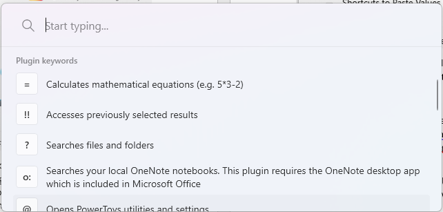
There are other utilities, too – Fancy Zones in PowerToys, or Dell’s Display Manager.

clip_image008

Split Screen viewing

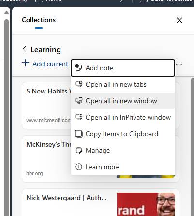
Of course, sometimes you don’t want to arrange multiple apps, but to see things side by side from within the same application. Windows has done a pretty good job of managing apps where there are several documents open at the same time, even if there’s only one “instance” of the application and it happens to have several files open. In Excel and Word, for example, though there’s only one app on the taskbar, multiple open files show as separate windows which can be snapped to different areas of the screen for easy cross-reference. You can tweak the “combined icon” behaviour if so desired.

clip_image010

Sometimes you might want to have several windows open from the same document; maybe you’re copying and pasting content from one part of a Word doc to another, or working on different tabs in the same Excel workbook.

In such cases, look under the View menu and create a new window, which can be snapped and arranged as desired.

clip_image012

The same menu lets you arrange multiple open documents in a variety of ways too; try Split or Arrange All to see the output.

Edge by Edge

If you followed the advice from the recent ToW #38 and bought yourself a gigantic, curved monitor, you might want to check out another feature in Edge that is there to make thing a bit more usable – Split Screen mode (whose icon looks a bit like the Immersive Reader, so it’s easy to overlook).

clip_image014

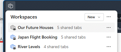
Since most people have lots of browser tabs open at the same time, Edge (and Chrome) tend to lump all the open tabs under one browser window, so you don’t clutter things up too much. You can move tabs between browser windows or even create a new window with just a specific tab (right click the tab and you’ll see the Move tab to > option), so could arrange separate browser windows using the normal snapping etc.

The Split screen view lets you quickly show 2 tabs side-by-side, and can prove very useful. While in split mode, you’ll see two URLs in the address bar…

clip_image016

Exit split screen or tweak some of the behaviours using the X and the “…” options buttons on the top right…

clip_image018

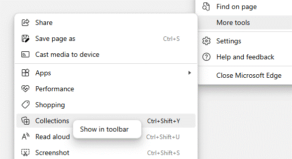
Finally, in Windows 11 and using Edge, you can make it show separate tabs in the ALT+TAB view of open applications, so they appear like they were separate windows even if they aren’t.

clip_image020

The wording of this setting makes it sounds like many apps would be able to support this (since “tabs” are appearing in other places like Notepad or Explorer), but for now, it’s only Edge.

#50: Object Oriented browsing notes

clip_image002

Obscure Computer Science theory had an obsession with “object orientation” some years ago; both a technique in how applications are written but also design thinking on how they might be used. Sensei Steve Jobs, while walking the earth before coming back to save Apple, had a famed obsessions for design and rooted his NeXT computer on an object-oriented approach. The NeXT Cube itself was arguably ahead of its time, but in 1990 cost a cool $10K (that’s about $25K in today’s money). There were few takers, though the odd geek still gets excited to pick them up 2nd hand.

An example of object orientation in user interaction is that you go to a thing you want to work with, rather than a tool with which you want to work. Elements of this are all over UX in Windows, like going to a document in Explorer, and it lets you open, edit, print, etc. Most people will still go to Word and open a file from there; that’s why the Most Recently Used list and Search features exist.

To start something new, you’ll likely open your app of choice then use it to create a file or open an existing one. When did you last go to SharePoint and use the New -> menu option to create a document in situ, much less a OneNote notebook? Exactly.

clip_image004

There are other places where things are less cut and dried: you might open a notebook like OneNote, Evernote, Notion etc, and start taking notes on a thing you’re working on. Or you might want to be in the flow – in a Teams meeting, or viewing a document on which you want to make some side notes – and it makes more sense to bring the notepad to the side and ideally keep the context so when you revisit that document or that webpage, you’ll (optionally) see the notes you had previously.

Progress is not forthcoming

Sadly, as apps evolve some features are sacrificed perhaps because telemetry tells the developer that they’re not much used, or they just decide that newer things are more important. One key villain in this regard is the “new” (Chromium) Edge browser, which left behind many of the features of the old(“Spartan”) Edge, which might not have been much used but then neither was the old Edge. The dev roadmap appears to focus on more ways to inject adverts and to jam Bing services and Copilot into everything, than to actually make the browser as useful as the one it replaced.

Linked Notes

As covered 18 months ago on old testament ToW 683, OneNote has the capability to be docked to the side of whatever other window is being used, and in some cases, maintains a link to the document that is in the main window.

clip_image006

You’d create the page you want to make notes on in OneNote, and when Linked Notes are enabled, it will tie back to the Word etc doc you were using in the other window. That way, if you re-open the notes in OneNote you’re only a click away from pulling up the document they relate to.

If you later go to back to it in Word, however, or open the doc directly from Explorer, there’s no obvious way to bring up the notes you were taking, without going to OneNote, finding the page you took the notes on, and perhaps docking the window again. Even the Linked Notes option on the Review menu doesn’t quite work as expected – it’s for establishing a new link, not reanimating an old one.

This is an example where true object orientation would work well – you’d open the Word doc which you had linked to OneNote, and you’d automatically see the notes in a sidebar.

Remember Internet Explorer?

Even ye old IE had an option of being linked in OneNote so you could take notes on a page you were viewing. Sadly, Edge has torched this feature – along with Reading List and one of the more helpful and semi-OO feature, which didn’t use OneNote but was still potentially handy…

Web Notes RIP

Web Notes was a feature of Old Edge, for jotting down simple notes on whatever page you were viewing, and the next time you visited that same page, the notes would be shown alongside.

Imagine if you were looking to buy a house or pretty much any other major piece of shopping; whilst conducting research, you might browse to several properties of interest and could make some notes about each one – near a good school but close to a busy road, nice rear garden, high crime area down the road, neighbour has planning permission to build a house in their back yard…

It could be so useful to jot the notes as you go and have them presented again if you happen to revisit the same page in future (so you remember you’ve already looked into it). If you could later see a list of every note you took, with a link back to its source, so much the better.

Sadly, there is no way to do this in Edge, without relying on extensions. There are many out there but none really hit the brief well – if you find a better one, please do mention in the comments below.

The OneNote Clipper is worth a look if you want to keep a list of notes with links back to pages, but is old school in that you’d go to OneNote to find that list and then see which pages you had commented on, rather than the more Object Oriented approach of viewing a page and having the notes offered to you.

clip_image008

Perhaps the extension which comes closest to the functional requirement (even if it doesn’t win many prizes for looks) is Note AnyWhere, available from the Chrome store (and can therefore be installed on both Chrome and “new” Edge).

clip_image010

For ease of use, after installation, click the Extensions icon on the toolbar and Pin the Note Anywhere icon to the toolbar, after which taking notes on a new page is only a couple of clicks away. When you next visit a page, previous notes will be displayed (or you can choose to just show a number on the toolbar by the icon, to show how many notes you’ve made).

clip_image012

It would be nice to have some simple formatting, and searching previous notes is a little clumsy (requiring you to sign up and sync with the developer’s web front end), but for a free app that doesn’t (yet) nag you to subscribe for extra functions, it’s not half bad.


PS – Remember, this weekend is when Europe (mostly) ends Daylight Saving Time, meaning next week could see clashing of meetings arranged with international attendees, before North America catches up on 3rd Nov. New Zealand and some of Australia has already made the leap.

This topic has been covered ad nauseam on previous ToWs … spring forward, fall back

#49: Managing Multiple Messaging

image

It used to be easy: you had an inbox (real or electronic) and new mail arrived. You’d check the inbox for anything that needed your attention, otherwise just get on with whatever it is that you were doing otherwise. Now, there are so many messaging apps that it can be a headache to not only keep on top of all the inbound contact, but to recall in which app you were having a conversation you want to go back to.

It might be easy if your professional comms is all done via email, but if you’re an itinerant consultant working with several companies, you might even have numerous professional email addresses too so keeping an eye on them all can be a chore.

There’s always a chance you’ll be dealing with LinkedIn or SMS messages with work connections as well, and with friends and colleagues there might be Facebook, WhatsApp and many more.

Two quick tips this week might help to get on top of things, if only a little.

Finding work-related messages in M365

If you use Teams and Outlook for work, with Microsoft 365, then you might already experience discombobulation when looking for something a colleague sent, or some comment discussed in the context of a project… was it in the status email, or in the chat of a meeting? Or a direct message in Teams?

clip_image004

Fortunately, the “Work” search options might be able to help. If your organization has it enabled, go to either Bing.com/work or look at the search option in Office.com while you’re signed in, and you’ll be able to search documents and other sources of data within your M365 environment.

clip_image006

One such is Messages – and the handy shortcut to jump there is aka.ms/messages. Type a search term in there and it will look across both your Outlook mailbox, but also in any Teams messages you might have been part of. Once you get used to checking it – and using the Work search for documents and other stuff – it’s a game changer.

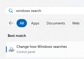
Another trick, for finding documents in your work context, is to search from Windows Search directly by pressing the WindowsKey and typing work: followed by something you’re looking for.

clip_image008

Search across OneNote

Though it’s not strictly messaging, you might have taken notes during a meeting (or even had your friendly Copilot overlord do it for you), potentially spread across several OneNote notebooks.

clip_image010

The search box in OneNote lets you choose if you want to perform a query across the current page, section, notebook etc – but the results you get back can be a bit clumsy to interpret as it doesn’t give any details on which are really old pages and which might have been written recently.

clip_image012

If you haven’t discovered the obscure ALT+O to pin search results, try it out – it lets you group by section, page title or date, and you can expand and collapse the groupings to help locate the most likely page more quickly.

clip_image014

Now, where did you put your glasses?

#48: When I’m Updatin’ Windows

clip_image002

Long-time users of Windows will doubtless be familiar with the occasional need to restart because some update or other has been sent to your machine. These days, the “your computer needs to restart” prompt normally gives you a chance to do it later, but there have been times when you literally get a few minutes’ notice to save all that important stuff you’re doing before the update/reboot cycle begins.

Particularly important updates might warn you of an impending restart and give you the chance to take the hit right away, or to wait until the middle of the night. You can set the Active Hours in Settings | Windows Update | Advanced Options and it’s possible to pause updates for up to a week if you need to do some important stuff and avoid a reboot, but the advice is generally to take them as soon as you can.

clip_image004

Social media users love to share examples of prominent PCs displaying errors, or notices about needing to restart, even if they’re not all that they seem.

It’s That Tuesday

21 years ago, Microsoft started using the 2nd Tuesday of every month to push out updates, informally known as Patch Tuesday. They have flip-flopped to some degree over whether these updates will be security/reliability only, or if unsuspecting users will get new features and changes. Big periodic rollups – the modern-day equivalent of the Service Pack – tend to contain loads of fixes along with some changes in the way Windows (and some of the standard apps) works.

clip_image006

If you’re looking at someone’s desktop in person or on a Teams/Zoom call in the coming weeks, and see that little double-arrow update icon on their system tray (though maybe they’ve hidden it), it could be that their poor PC has been waiting to restart for ages. That might tell you something about their standards of hygiene and organisation.

If you’re seeing the update symbol on your own taskbar, going into Settings | Windows Update will tell you what needs your machine to restart, and you could determine if it really needs to happen right now or if it could wait until a bit later.

clip_image008

Search online for the KB number to find out more about what a particular update does. The Knowledge Base has been around for decades; delve into the archives and there are some crackers, like the one-time warning that Barney (remember him?) might self-engage.

In October 2024’s Patch Tuesday, the latest big package of updates to Windows 11 was pushed out – taking the platform to version 24H2 – ushering in a bunch of changes and improvements. To find out more about what’s new, see https://aka.ms/windows/insidethisupdate.

To see what specific version of Windows you’re running, press WindowsKey+R and enter winver. Some earlier versions of Windows 11 – 22H2 – have reached “end of service” so won’t be updated anymore; you’d need to upgrade to 24H2 to continue getting any updates and fixes.

If you’re still on Windows 10, the clock is ticking – it’s due to go out of support in a year’s time, meaning it’s worth either upgrading to Windows 11 (or getting a new PC which already has Windows 11 installed). Some of the hardware requirements of Windows 11 – especially around security hardware – left plenty of users grumbling as some recently bought (even high end) PCs didn’t cut the mustard. Even Microsoft’s own Surface line had some notably glaring exceptions on the compatibility list – the previous flagship $4,000+ Surface Studio is not Win11 compatible, having been launched 5 years before Windows 11.

If you have an otherwise perfectly usable Windows 10 computer which is being blocked from upgrading to Win11 on hardware compatibility grounds, there are unsanctioned workarounds that might allow you to install and happily run the latest version.

Just be careful

#47: Using Copilot for (consistent) meeting notes

clip_image002

GenAI” like Copilot and ChatGPT has been evolving quickly over the last year or two, and the more experience people have in using it has also changed their approach. Just as providing better questions to get more accurate search queries from Google / Bing, getting the best results from Copilot or the like might depend on being specific enough with your questions.

Here’s a tip courtesy of Kat Beedim, Microsoft 365 MVP from Microsoft partner, CPS. Kat is using Copilot to summarise the output of a Teams meeting, in an alternative way to the built-in Copilot for Microsoft 365 method which generates a pretty decent summary (and was recently discussed in context of the OneNote integration). While the content is generally good, using the standard approach, you will likely get differing formats of notes from one meeting to the next, depending on what was said.

Kat’s approach is to download the transcript from a meeting that you’ve attended; this may be available to anyone who joined the meeting, even if the tenant hosting the meeting doesn’t itself have Copilot provisioned. In other words, if you have access to Copilot and you can get the transcript from a meeting (which you didn’t organise, maybe even one organised by a different company) then you can generate the meeting notes.

To see if the meeting was transcribed, go back to the Chat or the Recap from the meeting within Teams and you might be able to download the transcript (as a .DOCX file).

clip_image004

Save the transcript file to OneDrive in the same tenant where your Copilot for M365 is, and within a Copilot prompt you can reference it… if you go to Copilot (Work) and press “/” in a prompt, it will let you choose a file (or other source of data).

clip_image006

Kat has provided a very polite and detailed prompt for Copilot to generate meeting notes; by using the same prompt after every project or team meeting, the same format of notes will be preserved.

Copilot, please assist me in converting the attached /(start typing the file name to select it)
into detailed meeting minutes.

Here’s what I need:

1. Identify Key Sections: Break down the transcript into distinct sections: attendees, apologies, introductions, summary of concerns, previous actions discussed, further discussions, recommendations and actions, date of next meeting. Keep to that order.

2. Summarise Discussions: Provide a detailed summary of the discussions for each agenda item, capturing the main points and any consensus reached.

3. Highlight Decisions: Clearly state any decisions made, including the rationale behind them and any dissenting opinions if applicable.

4. List Action Items: Enumerate the action items that came out of the meeting, specifying the responsible party and the deadline for each task

5. Note Attendees: Include a list of attendees and their roles or titles, as well as any apologies for absence.

6. Format for Clarity: Use full sentences and paragraphs, tables, and bold text for emphasis where necessary to enhance readability. Do not use bullet points.

7. Review for Accuracy. Ensure that the minutes reflect an accurate and impartial record of the meeting, and make any necessary edits for clarity and conciseness. Please format the minutes in a professional and presentable manner. suitable for distribution to all meeting participants and for record-keeping purposes. Thank you.

You could also open the transcript directly in Word and enter the gist of the prompt above in Copilot within Word, though formatting is a bit nicer when done from the Copilot for M365 prompt. It might be possible some day to tell it to generate a new document using a set template, but that appears to be a manual process for now.

Feel free to have a play with the prompt to get the format and the answers you want; you have 2,000 characters to give your instructions so be as descriptive as you like.

Kat’s video demo is on Write meeting minutes with Copilot – YouTube.

#46: Cool for CALC

clip_image002

Subtle changes and refinements to regularly-used applications can often slip by unnoticed. The Windows Calculator can trace its parentage all the back to Windows 1.0, and has seen numerous revisions over the years. It has featured in previous ToWs, too, most recently in what would have been number six hundred threescore and six, before the Great Reset meant ToW numbering went back to 1.

Electronic desktop calculators were a hotbed of technological innovation in the 1960s and 1970s. If you’re of a certain age, you might recall using a pocket calculator as part of your educational journey. When the first scientific pocket calculators appeared in 1972, they had a similar impact to the global slide rule market as quartz wristwatches had on the mechanical watches a decade later.

clip_image003

c1985 Casio fx-451M

When Personal Computers were a relatively new thing, having things like a digital notepad and a calculator built-in were seen as key productivity features; even if an IBM PC capable of running Windows 1.0 at the time would have cost you more than a year’s average salary. And yet with calculators on phones and smart watches, the poor old CALC.EXE probably doesn’t get much love these days.

clip_image005

The Hamburger Menu

Fire up the app (WindowsKey+R Calc [ENTER]) and it looks like any simple desktop calculator device, except that the History (top right) is much more extensive and usable than the stupid M+ / MR buttons on the old physical ones. Few of us knew what all those buttons festooning scientific calculators actually did, let alone ever used most of them.

Fortunately, Windows Calc has put lots of genuinely handy things in that three-line menu on the top left – and you can switch between them using the ALT key, if desired.

clip_image007

In normal use, simply pressing ALT+1, ALT+2, ALT+3 etc will switch between the different modes; open the hamburger menu (click it or press ALT+H), and scrolling down will show more than a dozen different conversion features too. Just press the ALT key when the menu is showing if you’d like to be reminded of the ALT+ … shortcut keys that can be used to invoke any of them without the need to show the menu in future.

Before Microsoft killed its long-serving line of external keyboards, some used to have a hardware button for invoking calculator. Supposedly, they’re coming back – just under a different name.

clip_image009

If you’re more mouse- or touch-driven then you can also jump to the primary modes using a right-click/long-tap on the taskbar when Calculator is running.

clip_image011

If you think there’s some great feature missing from Calculator, check out the Github page on the project and submit your own ideas. It seems to be on a slow-burn though; the Roadmap page talks about what the team is focussed on in 2021, and makes no mention of Windows 11…

#45: Copilot updates flying in

clip_image002

Microsoft unveiled “Wave 2” of Copilot for Microsoft 365 earlier this week; if you haven’t seen the video, you can catch it here, or check out Teams guru and MVP Tom Arburthnot’s tl;dr summary of the key announcements and the demos.

BTW, if you are a Microsoft partner, you might have heard during MCAPS Start in July, that (woo-hoo!) Microsoft was going to give you some free Copilot licenses as part of the benefit of being in the partner program.

The latest Benefits Guide shows that Copilot goodness is indeed coming in January 2025, but it might be a bit less generous than expected… Basically, don’t bank on getting more than a handful of seats as part of the package, and if you don’t think Copilot gives you enough benefit to bother paying for it, then, well…

Talking of “what’s new” with Copilot, Microsoft veteran Malcolm Bullock has a thought-provoking explanation of what he means by “Nothing has changed but everything is new”.

Some of the stuff that was announced in the Wave 2 jamboree will be coming later this year, such as Copilot automatically prioritizing your emails in Outlook. Other pieces – the Narrative Builder in PowerPoint, for example, are here already.

The PowerPoint Copilot functionality is amazing. Give it a couple of lines of content and it will generate a whole load of slides by finding out information to flesh out your idea. If you’re an expert in an area then it might seem to give a glib, high-level overview with not-quite-correct images, but all of that can be tweaked and updated later.

Here’s an example:

clip_image004

… and literally a few moments later, it presented…

clip_image006

Not bad at all. At least it has a framework which could be used to flesh out stuff in more human detail.

While Copilot might have its most immediate use in helping to create content like images or writing documents/emails for you, there are other collaborative benefits too, some of which were covered in the announcement. As Malcolm says above, maybe we will need to tweak how we collaborate (using channels instead of chat for group discussions, for example) to properly harness the capabilities to good effect.

On asking Copilot in Edge to summarize the announcement page to less than 200 words, it offered:

· Copilot Pages: Introducing a dynamic, persistent canvas for AI collaboration, allowing teams to work together in real-time with AI-generated content.

· Enhanced Microsoft 365 Apps: Significant improvements in Teams, Excel, PowerPoint, Outlook, and Word, including new features like Copilot in Excel with Python for advanced data analysis.

· Copilot Agents: New AI assistants to automate and execute business processes, with an easy-to-use agent builder for creating custom agents.

· User Feedback and Updates: Over 700 product updates and 150 new features based on feedback from nearly 1,000 customers, improving performance and user satisfaction.

So there are lots and lots of new features coming, if not here already. Yay.

Meetings, transcripts and notes

One of the nicer new widgets that Copilot has brought recently is for putting meeting notes into OneNote. Previously, to record what happened in a meeting, you’d ask either Teams Premium or Copilot to generate some kind of notes, then copy/paste the text into OneNote alongside other stuff you might have jotted down yourself during the meeting.

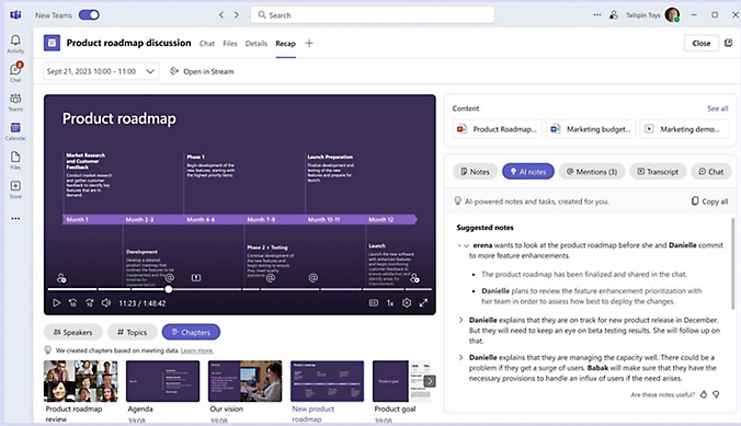
Now, it’s made the process a whole lot easier – first, you need to be sure the meeting has been recorded or transcribed. If you go back to the Meeting inside Teams (look in the Chat node), you might see a Recap option which will give you the summary of what happened, along with actions that were discussed:

clip_image008

Now, go into OneNote, navigate to your existing notes page for a meeting (or create a new one) and go to Insert Meeting details. It will offer you a pane on the right side showing a selection of meetings from your calendar.

clip_image010

Previously, this would have copied just the bumph from Outlook like the date/time, subject and who the attendees were – useful as that is – but now has added a bunch more…

clip_image012

It’s a brilliantly useful way of adding some extra content to notes you might already be taking, or just to more easily organize notes and follow up actions from within OneNote rather than grubbing about in Teams to find them.

#44: What’s on your (system) tray?

clip_image002

The System Tray is that little collection of icons typically found next to the clock, in the lower corner of a Windows desktop. It’s been part of the UI since Windows 95, and serves to highlight what is happening with the system and the apps that are running on it. At times, Microsoft has tried to call this the “Notification Area”, not be confused with the thing that appears when you press WindowsKey+N (that’s the Notification Center or Action Center).

In common with other bits of Windows (the right-click menu in Explorer being another), it was easy for 3rd party software and hardware drivers to add their own icons into the “systray”, which might make things convenient for the user until they have 30 or 40 such things cluttering the whole place up. Why wouldn’t you want to quickly control your video modes or tweak Bluetooth settings, after all?

So in sweep-under-the-carpet style, Microsoft added a way of hiding less useful system tray icons so you don’t see them all the time, but they can be exposed by clicking the little arrow to the side.

clip_image004

As you’d expect, Microsoft has defaulted only the more obviously-useful icons to be visible, like battery or Wi-Fi (for laptops), sound/volume etc. OneDrive is jammed in there too, if you have it set up to sync.

To tweak which icons show by default, look in Settings > Personalisation > Taskbar (try right-clicking on a blank bit of the main taskbar and choose Taskbar settings)

clip_image006

Many of the icons you’ll see don’t necessarily do much when you click (left or right) on them, other than jump to the app itself, but some afford the ability to right-click and do something in that app directly. One useful tweak not there by default might be to include Teams, so you can quickly set your status.

clip_image008

To hide or change the clock and date in the System Tray, dive a little further into the Date & time settings…

clip_image010

… and you could have the clock show seconds as well, if you really wanted.

clip_image012

This week’s Copilot-drawn banner image is – clearly – inspired by Eddie/Suzy Izzard’s iconic and lightly sweary “Death Star Canteen” sketch, and the minifig animation of it. Happy Friday – but you’ll still need a tray.

#43: Designing Everyday Things

clip_image002

Design is everywhere in the things we have made. Intentional or inherent, every object is that way for a reason. Whether an item’s design is primarily to make it easy and obvious to use (see Bic), just to look amazing, or for some amalgam of form and function, we often know it when we see it. Sir Lord Kevin McCloud has made a career of pointing out things that have been done well, or perhaps have not.

Some of the best designed things, however, are impactful because we don’t notice the effort that has gone into them; the designer thought hard about it, so the users do not need to. It’s no accident that 3 of the top 10 in Fortune’s updated “100 Best Designs” list originated at Apple, where Steve Jobs placed good, user-centric design and “taste” at the heart of what they do.

In 1988, a seminal book on aspects of product design thinking was published, “The Psychology of Everyday Things”. It later changed to The Design of… as bookshops and libraries were apparently lumping it in the wrong category, it being more about how products should be designed rather what makes us inherently tick.

A few examples highlighted in DOET of things that could be done better include the physical layout of light switches and the lights they operate, or knobs on a cooker vs the position of burners or hotplates they control.

Often the controls are in a straight line across the front of the cooker, but the elements or flames are in a square. To make it easy for you to know which knob works which heatsource, a simple and obvious symbol is positioned nearby. Better hope those don’t wear off over time.

clip_image004

Wouldn’t it be easier for the end user if the knobs were placed in the same pattern as the burners? That way, you wouldn’t need a symbol to inform you; instinct would make you start with the correct one (assuming you were paying some amount of attention).

Another example is door furniture. On the types of corridor doors which you’d find in offices or public buildings, it’s not uncommon to put a handle on the door. Instinctively, you will grab a handle if offered it, and the first thing you’ll do is to pull it (as DOET puts it, that is the action which the handle affords you). That’s fine if the door opens towards you (or swings both ways), but if not, you’ll instinctively pull it first before realizing it doesn’t move and therefore needs pushing.

clip_image005

Similarly, if all the door shows is a blank pad, you’ll open your palm and give it a push. No need for a sign to tell you what to do (well, unless you’re from Midvale).

clip_image006

Aesthetically, glass doors might look better with a handle on both sides but function over form should mean they’d look better still without a push/pull sign, and they’d be easier to use.

Even London’s Design Museum falls foul of the odd rule now and again…

eclip_image008

A grab handle, on a push door? Sacre bleu! (in mitigation: it looks like the handle could be used to pull the door shut to lock it, but still…)
The DOET book has been updated a few times in its life (since its re-identifying from POET) and is highly recommended.

Controlling everyday software things

For a 20-year-old tome on poor software and UX design, see The Inmates Are Running the Asylum: Why High Tech Products Drive Us Crazy and How to Restore the Sanity. Written by Alan Cooper, “Father of Visual Basic” and respected author on interaction design (a nuanced idea, as opposed to interface design), it’s a fascinating insight into design thinking in a software age.

An example given is of designing the user interaction for an in-flight entertainment system; developers will often institute fiddly directional cursors, modal buttons, controls that need to be labelled so you know what they do. Cooper replaced most with a simple rotating knob; the user will quickly figure out what happens when they turn it right and left. Push the knob to select something, maybe add a Back button and you’re pretty much done.

Bringing things up to date, even though a lot about software and interaction with technical systems could be improved, a great deal of effort is put into simplifying things and trying to remove extraneous UI elements.

clip_image010 Icons, of course, have their own life – there’s that meme about kids thinking that a 1980s 3.5” floppy disk is a 3D printed save icon. At least if you hover a pointer over most icons, you’ll get a pop-up to tell you what it is.

Windows 11 made some controversial changes to things that power users knew and liked, but for most people they just get used to it and if they ever had to regress to an earlier version, would probably admit they liked the newer one better.

Too many options

The Right-click menu in Windows Explorer has long been cluttered up with lots of options; software you install would add an item to make it easier to operate on that file (Share with Skype! Edit with ClipChamp!). In Win11, many of the lesser used ones were moved to a secondary menu supposedly to leave only the mainstream stuff behind…

clip_image012

Clicking the Show more options menu item (with an icon which looks like making a window bigger) will display the old-school Windows context menu which could easily have 30 or 40 things on it.

Back on the “Fluent” Windows 11 context menu, the very most used options – cut, copy, rename etc – were promoted to icons at the very top or bottom of the menu, and for lots of users promptly disappeared from view.

clip_image014

This is something which is going to be updated in a soon-to-be-released update, to make it easier to use…

clip_image016

Control Panel Still Alive

Microsoft is still working on replacing some of the last vestiges of old Windows code, just one example being the Control Panel. A key part of Windows ever since version 1.0, it was where you tweaked anything to do with the operating system or the PC. Since Windows 10, most of the key bits you’d configure using Control Panel were migrated to the Settings app but even today, there are some bits of the UX where you’ll fire up an old-fashioned looking Control Panel applet … often buried in the “Advanced” part of Settings, and identified with the square-thingy-arrow-up-right icon, which we learn to know means opening something new…

clip_image018

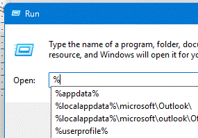
These Control Panel “applets” which remain in Windows can be found by looking in the System32 folder – to invoke any of them just to see what they do, press WindowsKey+R then enter the name of the .cpl file and prepare to be amazed and/or confused.

clip_image022

clip_image020

Gradually, though, these CPLs are being replaced – see desk.cpl – with enhancements to the Settings app, but there’s still life in the old control yet…

clip_image024

expand the Control Panel section in System configuration tools in Windows – Microsoft Support

#42: Making Gestures in & out of Windows

clip_image002[6]

Windows, you may or may not know, has a lot of gestures built in. Not the kind that Mr Clarkson observes while driving a flash car, thinking oncoming motorists may be drying their hands, but more useful. Windows 8 pioneered gestures on touch-screen machines, where you’d swipe around the edges of the screen to perform certain tasks.

If you’re unfamiliar with modern-day gestures, they inhabit a number of rooms in the house. They are perhaps less on the critical path to making stuff work than the Win8 things that confused regular end users; gestures these days are there to provide a quicker or snazzier way of doing something for those in the know but if you don’t use them, you don’t know what you’re missing.

Touch

Firstly, there are touch gestures – if you have a touchscreen machine, obvs. These are relatively simple actions you can do on-screen using multiple fingers, which control the way you interact with Windows. You might have them turned off, but they should be on by default – look under Bluetooth & devices in Settings, and under Touch you can switch them on.

clip_image004[6]

If you see the “Touch screen to wake” option, you’re using an up-to-date machine which supports Wake-on-Touch, allowing you to poke the screen with a single digit to wake from standby.

If you have a touch screen, you’re probably familiar with selecting stuff by tapping it or scrolling the screen by dragging it around, but there are other moves you might be less familiar with. What about showing the Notifications Center by dragging one finger – Win8 stylee – from the outside right edge of the screen, or the Widgets by doing the same from the left?

How about using THREE fingers to swipe up, down, left and right?

clip_image006[6]

Pad

If you don’t have a touch screen but do have a laptop with a touchpad, there are loads of gestures you can enable and configure there… somewhat similar to the on-screen versions.

clip_image008[6]

Did you know that tapping two fingers (close to one another – eg two fingers on one hand) on the touchpad has the same effect as right-clicking? See more on Touch gestures for Windows.

Browsing gestures

Finally, even if you don’t have the delights of touch on screen or pad, there are gestures you can set up on Edge for using your mouse while browsing – in fact, they’re possibly best done with an actual, physical mouse rather than faffing about with a touchpad.

To enable, make sure your browser is up to date then check Settings / Appearance and scroll a long way down to Customise browser. Or just search gesture in the settings and look for the enable/configure Mouse Gesture buttons.

clip_image010[6]

Gestures in the browser let you do stuff by holding the right* button on your mouse in combo with an action like swiping the mouse in a direction or using a pattern:

clip_image012[6]

While you hold the right mouse button down and make an appropriate mouse movement, you’ll see it being drawn on the screen with a banner telling you what it means…
clip_image014[6]

If you don’t like the default gestures in Edge, or you’re using Chrome, then you could try a 3rd party gesturing addon: Chrome Web Store – Search Results.

* for a while, Microsoft tried to call the right mouse button – one of the big differentiators between Windows and Mac (whose users could only deal with a single button) – the “secondary mouse button”, in recognition that left-handers who swap the buttons around are not using the actual button on the right. Or right-handed deviants who like using the wrong button.
clip_image016[6]