#31: Easy and Excel-lent Data sources

clip_image002

Most people who have spent time using Microsoft Excel will realize that it probably has more capabilities than they’ll ever understand, much less use. There are so many functions used to collate, display and interpret data that it’s no wonder people turn to using it for all sorts of things.

There have been numerous attempts to make user-friendly data tools for Excel, from web-scraping 3rd party sites to the short-lived Money in Excel for American users which bit the dust before it was barely out of diapers.

More recent releases of Excel include several Linked Data Types which can retrieve and manipulate data from “reputable sources of data, such as Bing”… (which, incidentally, had its 15th birthday recently). Companies with suitable data governance can expose internal info for analysis, or regular end users can get started with share prices, currency conversions and geographical data.

clip_image004

In the Data tab in the current versions of Excel on multiple platforms, you’ll see 3 or 4 types of data that can quickly be inserted – they will perform a lookup on external information and return a data set in the background which can be displayed and otherwise interacted with using formulae, lookups and other standard data tools in Excel.

clip_image006

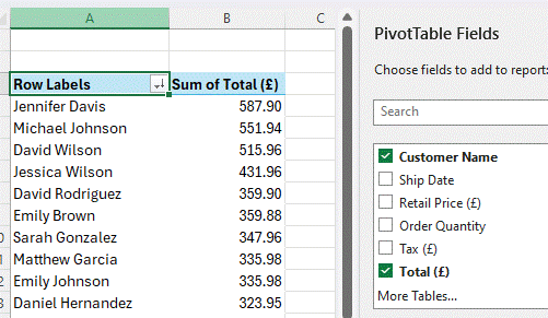
Getting real-time data is pretty straightforward – create a blank table with a single column in which you’ll enter your key data items that you want to expand on – for currency conversions, it would be a pair of currency symbols (USD:EUR or GBP/USD etc) that you then select and mark as Currency from the data tab. That then lets you easily add other columns for specific lookup data, and that can be referenced itself through other formulae too.

clip_image007

Stock lookups work similarly, by entering the ticker symbol in one column and potentially going through a matching exercise to find the right one. Handy, if you have a workbook for calculating when you can stick it to the man and retire to a patch in the Tuscany hills: you can automatically look up the stock values and convert their currencies too, if required.

clip_image009

There’s some location stuff as well, invoked by entering city or area names; it’s more text-based reference info which is returned, though it might be possible to feed some of the data into a Map Chart for further visualization.

#30: Snipping Smarter

clip_image002

Wclip_image004indows’ Snipping Tool, used to capture an area of the screen, has been around for a long time in various guises, even threatened with cancellation at least once. Invoking the tool by pressing SHIFT+WindowsKey+S or just hitting the PrtScn button (if you have one) now displays a small dialog at the top of a dimmed screen.

You can choose to capture a static image (of a part of the screen, or the whole thing) or a record a video of a marked section of the screen, optionally with your own commentary – useful for sharing a quick “how to” video.

Another way of capturing the entire screen is to press WindowsKey+PrtScn, which can be useful when trying to grab menus and things that might disappear if you tried to interact with them – like the first image above, since the screen grab menu itself will disappear as soon as you click the mouse button.

As well as copying the snipped area to the clipboard, an updated Snipping Tool from about 18 months ago also saved them to a Screenshots folder, so it’s easy to go back and fish them out later. See 665 – Mind your screenshots for more details; it’s worth keeping an eye on that Screenshots folder so it doesn’t get overly large and/or contain stuff that you might not want to keep.

REDACT THE gggg TEXT

Some further updates to Snipping Tool have been happening of late; there’s some nice functionality which lets you extract text from the grabbed area to the clipboard (as paste-able text rather than an image), or to redact certain bits of the screen so as to preserve potentially confidential info.

clip_image006

The Quick redact feature tries to identify some data types, but to manually scratch it out, just select the text you want to hide, right-click and choose Redact.

clip_image008

When you’re happy, click the Copy button on the top right

clip_image010

And that will put the fully redacted version into the clipboard, either replacing what was there before or adding it to the list if you have Clipboard History turned on.

clip_image012

Another newish addition is the quick ability to feed your screen grabbed image to the Visual Search in Bing, effectively doing a reverse image lookup – just look in the menu on the top right.

clip_image014

#29: The power of CTRL

Designer (7)The familiar computer keyboard has evolved over decades, even though some languages have obstinately different layouts; Germans have QWERTZ and French users have AZERTY, while Brits used to their usual keyboard might struggle to find the backslash on an American machine, and accidentally hit Enter when looking for the hash key.

clip_image002

Most keyboards feature control keys on the bottom corners; designed as a “modifier” to be used in conjunction with other keys to activate certain commands, there are some well-known combos like CTRL+C and CTRL+V for copy and paste. There are outliers – German keyboards have Strg instead of Ctrl, and even an obsolete ISO standard says the key could be marked “”.

There are some occasions when the Control key is not just a straightforward modifier; aside from using Sticky Keys to keep it pressed, one somewhat hidden feature in the Edge browser turns Ctrl to good effect, for opening an image in a zoomable overlay window.

Many images embedded in web pages are much bigger than you might think; the source picture could be something like 2000×1500 pixels in size, but when displayed on the site, it’s reduced to 640×480. In such cases, you can use the CTRL key to magnify the original image without having to navigate away from the current page.

If the Edge window is in focus, move your mouse cursor over an image and try tapping CTRL twice; if the site can support it, you’ll see the image displayed in a pop-up window that lets you zoom in out (with the mouse scroll wheel or by stroking your laptop touchpad).

clip_image004

If you have the PowerToys addon pack installed, you may also have Find My Mouse enabled, and that too uses one of the Control keys as its activator. Happily, if a little confusingly perhaps, both can co-exist so you’ll expand the highlighted image while temporarily spotlighting where your pointer is.

clip_image006

#27: Lookup Image Reverse Using

With all the fuss about AI in recent months (the latest being OpenAI teasing some futures with GPT-4o, and potentially raining on Google’s I/O parade that followed the next day), it’d be easy to overlook that elements of artificial intelligence have been infusing the software and services we all use every day, for years. Google are even revisiting an old Microsoft brand too

Text, handwriting and speech recognition, language translation, cognitive understanding – they’re all milestones to what people might think represents true AI, and using elements in conjunction with massive amounts of data has given us some incredibly useful capabilities.

One such is being able to do a reverse image search – the idea that if I have a thing, or a picture of it, how can I find out more about it, or where it’s being used elsewhere online? Copyright holders might want to search for unauthorised use of their materials, or we can even use the technique to tell us more about what our phone camera is looking at.

clip_image002Visual Search

The Bing search engine has had a visual search feature for many years – that’s right, some people do still use it, even by choice rather than because it’s the default or due to a nag screen.

The simplest way to use Visual Search (if you’re using Edge browser and Bing is your search default) is to right-click on an image and choose the Search the web for image option, which feeds the picture into the visual search page.

clip_image004

This will show you other places on the web that feature the exact same image (and in different sizes, too) as well as displaying other, similar images.

clip_image006

If the pic you started with is a recognizable place or person, it may offer a suggestion of what/who it is, with links to further info..

clip_image008

If you’re not using Edge and/or Bing isn’t your default, you can use it by copying the image you want to the clipboard (or grabbing a portion with the Snipping Tool), the go to the Bing homepage and click on the Image search icon.

clip_image010

Just paste your image in from the clipboard (press CTRL-V, or if you’ve switched on Clipboard history, WindowsKey-V will let you choose from previous ones too) to run it through image search. You can, if need be, adjust the area being searched for, by clicking the Visual Search icon towards the bottom of the main image, then dragging the handles to crop the area you want – picking out a single person in a group photo, for example.

clip_image012

Google offers the same kind of functionality, too – from Chrome with Google search as the default, choose Search image with Google,

clip_image014

… or try search by image from the homepage…

clip_image016

… and paste the selected image in there.

You’ll see slightly different results from the different search engines, so it’s definitely worth trying both out. The Bing user interface is arguably nicer than Google’s but in the end, it’s the results that count.

Mobile apps

When it comes to dealing with the real world rather than online photos, smartphones clearly provide a great starting point. The main Google app has the same initial image search UI as the web site but lets you point your phone camera at something and extract text from it, identify what it is and find out more. The Bing mobile app (and Microsoft launcher on Android, if you use that) does similar things but nowhere near as effectively, judging by the results it returns.

clip_image018

There are many specialist mobile apps for identifying specific things, like differentiating between a plant or a weed, but it’s worth trying the Google app first.

clip_image020

The Bing mobile app purports to do similar things, too…

clip_image022

Nul points

Coming back to looking for pictures, if you don’t get any meaningful results from search engines when trying to match an image, there are specialist services like TinEye, which offer deeper reverse image search.

Take this image from a blog post many years ago, before mobile video calls were really a thing*. Searching Bing/Google for it brings nothing of note, but TinEye found various sites which took part of the image and repurposed it – various nutjobs used the image in “news” that the next gen iPhone was going to have video conferencing capabilities, neatly overlooking the fact that the main subject of the photo had a curly-wired handset to his ear…

Screenshot 2024-05-16 160755

* in fact, Orange launched the SPV M5000 smartphone – aka HTC Universal – in 2005,

clip_image025

and it was the first 3G “phone” which had a front-facing camera for doing video calls. It wasn’t very good.

#25: Where shall we meet again?

Designer (4)

If you are of the 400 million or so users of Microsoft 365, you probably use email as one of the key services, provided by Exchange Online. A little more than 28 years ago, Microsoft released Exchange Server, its first proper server product* and a key progenitor of Active Directory, an enabler of pervasive use of email in business and even standardising the means to deliver mail to your mobile.

Though its main usage is email and calendaring, Exchange was designed in an era when “groupware” was the next big thing; the idea was that the server would be a database of loosely structured data that end users would interact with using forms to display and edit those data. As it happens, an email message is just a bunch of data items like the recipients’ names, the subject and a whole load of hidden fields used in routing, storing and managing that message. When you open that message in Outlook, it uses a form which looks like an email to interpret the fields.

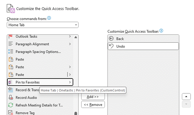
clip_image002Outlook 97 and its numerous successors all feature a form editing capability – right-click on the toolbar, choose Customize then on the resulting dialog, you’ll see a hidden “Developer” tab.

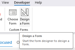
Tick that box to unveil it and you’ll see a new ribbon tab with all kinds of functions, one of which is to choose a form from various libraries, or even design a new one (based on an existing form, such as an email or a contact card).

clip_image004

A relatively simple use of this kind of thing would be to add a custom field or two to an existing form; it might be easier to use categories but if you wanted to include some more structured information to a contact form, for example, you could put additional data fields with validation logic behind them. Essentially what you’d be doing here is adding some custom fields to the database, and you’d also be customizing the form which is used to view and edit that newly extended data structure.

For one practical application of this technique, see ToW 259, which shows you how to track who you sent and received Christmas cards to/from, by modifying your contacts form.

The downside of customizing a form is that you need to distribute the newly extended form otherwise people won’t be able to see the additional fields – that’s essentially an automatic process when using Exchange and Outlook within a single organization (the form is published on the server), but it becomes a whole lot messier when dealing with external parties. And it doesn’t work at all on web, or mobile, or the “New Outlook” (which is basically the web client wrapped up to look like an app). So, it’s super useful these days.

New Outlook, new Meetings

clip_image006One of the subtle changes that New Outlook introduces to anyone who switches from Old Outlook, is a change in name to a key part of its functionality. In Outlook, you have appointments (which are things you put in your own diary) and meetings (which are appointments to which you invite other people or resources – or have been invited by the organizer – and that changes the form which is used to interact with the calendar entry).

New Outlook simply has “Events”, which essentially combines the previous two concepts in one. As well as a different UI, New Outlook adds some other functions, like the “In-person event” button, which lets you make the point that a meeting is taking place IRL rather than only virtually.

clip_image008

This same functionality is not available in Old Outlook or in mobile versions, only in Web App and New Outlook – but that doesn’t really matter too much, as all the “in-person” switch does is to append “[In-person]” to the end of the Title line.

Clearing the switch removes the text, though it’s just searching for that string and hacking it out (set a Subject line of I like people [In-person] [In-person] [In-person] and then toggle the switch back and forth a couple of times to observe). A more elegant way of building this would have been to make a new field on the Appointment / Meeting object called “in-person” and then had Outlook et al flip that switch, rather than just tagging a bit of text on. Oh well

If you’d like to explore what lies beneath your favourite Outlook form, try opening the item (Contact, message, Task etc) in Old Outlook, and if you don’t see a Developer tab, repeat the exercise from earlier and right-click / customize / enable Developer. You’ll then see a “Design This Form” option, which flips your current item into developer mode, exposing hidden regions. Look in the “all fields” tab, and you’ll find every property that has been set on the item.

This trick can be useful for finding out when an appointment has really been created in someone else’s calendar (if they share their calendar) – if they are suddenly unavailable to meet, you could see if they had that blocking appointment in there already or just created it after you’d asked…

clip_image010


APPENDIX

Email was first invented in 1971, and by the mid 1990s it was in common use amongst people who worked on terminals or desktop computers as a large part of their job. While standards like X400 and SMTP existed for exchanging email with other entities, you weren’t going to be emailing your bank manager or booking a doctors appointment. For some reason, X400 never really took off as intended – who knows why? Most companies which used email relied on it for internal communications – IBM’s NOSS internal system (a PROFS implementation) had over 350,000 users by the end of the 1980s, with no easy way to send email to external parties.

As dial-up services like AOL and ComuServe started gaining popularity amongst home users, and those walled-garden opened up and allowed exchange of email over the internet, companies began to adopt email more widely and people would start to put their email address on their business cards (alongside their fax number).

*Exchange was arguably Microsoft’s first proper server product, apart from Windows NT Server on which it ran. There were other back-end products which pre-dated Exchange, like SMS (systems management software), SNA server (for communicating with mainframes) and the early NT variants of SQL Server which had been based on Sybase’s SQL Server. These and Exchange had been bundled together as Microsoft BackOffice for a while. Exchange was the first Microsoft server product that most end users would interact with.

#21: Dating OneNote

Designer (2)

It’s not hard to find websites listing “the best apps for … in 2024”, usually covering the same options that were doing the rounds in 2023 and 2022, with a few tweaks. The category of note taking, across web, desktop and mobile, is a common theme, sometimes offering head to head comparisons between leading options like Evernote vs OneNote. If you’re committee to one note-taking app, you’re not very likely to switch, but maybe there are people who scatter their stuff across multiple services and apps and are looking to centralise on just the one.

OneNote has had plenty of attention in ToW’s passimsee the archive – but even with decades of familiarity, it’s easy to miss some really useful capabilities that can improve the user experience. Let’s have a look at some, concerning the topics of date (and time, probably, since the continuum thingy means the two are inextricably linked).

Inserting dates & times

clip_image002This one is easy, and its utility will depend on how you go about taking notes. If you start a new page for each conversation or topic, then you’re probably covered to a large extent. When you insert a page, OneNote will automatically tag the top of it with the current date and time…

In the days when (at least) two OneNotes (yes) were jostling for position, the new One wouldn’t let you edit the date or time of an existing page, but the old One did … and since it vanquished the upstart, still does. Just click the date (or time) and then the calendar (or clock) icon that appears next to it, and you can set the appropriate measure.

clip_image003If you’re more the type who has one long page of notes (around a single topic, or a single person who you meet multiple times, for example), then inserting the present date/time is near essential when appending or updating stuff – just go to the Insert menu and choose your datum | data.

Of course, keyboard warriors will want to remember the handy shortcuts to insert the current date (ALT+SHIFT+D), time (ALT+SHIFT+T) or both (ALT+SHIFT+F). The first two also work in Word and in Old Outlook (which uses Word as its editor), but don’t work in New Outlook, which doesn’t.

Reviewing old edits

clip_image004One easily-missed trick in OneNote is to see when a piece of text was last updated. It’s pretty clear if you’re sharing the workbook with someone else, as their updates are (optionally) highlighted and can also be searched for.

clip_image006Look at your own notes and if you hover the mouse over any text or other content, you’ll see a small grey paragraph marker on the left; right click on the text and you’ll see, at the bottom of the context menu which appears, the author who made the last change, and when.


Search and find by Date

If you have a lot of notes, searching for a specific term might return many results, possibly spread across multiple notebooks and not necessarily presented in a useful order:

clip_image008

Look at the bottom of the search results dialog, however, and you’ll see an obscure feature: Pin Search Results (ALT-O), which will open the results in a side window, allowing you to filter and sort them more effectively.

clip_image010

This clearly makes it easier to find the most recent edits you’ve made with your search term. Add this ALT+O to your OneNote arsenal. While you’re at it, make sure you also install OneCalendar, which shows a view of your previously-edited pages on the days you edited them.

#20: Choosing Characters

clip_image002Windows still has lots of really old bits that can trace their lineage back to Windows 95 or even before. One such app is “Character Map” – used for picking a specific letter or symbol from the many fonts available, the idea being that you can then paste it into the document you’re working on.

clip_image004

Selecting some of the characters, you’ll see a “Keystroke” comment on the lower right; if you hold the ALT key down and type those numbers on your numeric keypad (only), it’ll insert that character in your document, email or whatever. Or just Select it, click Copy then paste as normal.

clip_image006There are other ways to choose characters, of course – press WindowsKey + . (ie Win+full-stop) and you’ll get the dialog introduced to make it easy to pick emojis, but which also presents myriad symbols.

Office Apps typically have a “Symbols” item on the Insert menu, which lets you pick the more commonly used ones too. There’s a somewhat obscure Office feature, too, where if you type the corresponding hex number (like 00F1 as in the screenshot above) then press ALT+X, it will convert that code to the requisite symbol. Insert a special symbol through another means, and if you put the cursor after it and press ALT+X, it will replace the symbol to show the code you could use – press ALT+X again and it’ll be back to symbol as before. How obscure.

21st Century Charmap

If you fancy a modern looking character chooser which also gives you lots of info about the fonts as well, check out the free 3rd-party Character Map UWP from the Microsoft Store.

clip_image008

There are lots of other functions, like an easy visual comparison of different fonts – even if the default phrase has a quick brown dog and a lazy fox…

clip_image010

See more on its history on GitHub.

#17: Stickier than a sticky thing

clip_image002

When a researcher at 3M accidentally failed to invent the kind of adhesive they were trying to, and instead produced what went onto become the iconic yellow sticky note, no-one could have imagined that more than 50 years later, there would still be a $2.5B market for them.

Even digital note-taking hasn’t quite replaced the scribbled-down utility of a little note by the side of your desk, though IT security boffins would surely wish that users would stop writing their passwords down and sticking them to the side of the screen.

Software developers have, of course, produced many apps which can be used to semi-replicate the quick note-taking capabilities of the paper version, and 3M even sued Microsoft back in 1997 for referencing a similar feature in Office 97 as “post-it”. Oops.

Fortunately, hatchets were buried and 3M even launched a Post-It® app for Teams, though that lasted less than a year and has since “gone away”.

Microsoft produced its own Sticky Notes app (also for iOS devices and Anroid phones, especially if you’re using the Microsoft Launcher) which latterly integrated with OneNote and even back to the old Outlook notes capability.

Windows users might also be excited to learn of the new Sticky experience which was announced a few weeks back – currently available in the preview version of OneNote, but soon to arrive as a fully-fledged replacement of the previous Sticky Notes app.

You may see “Sticky Notes” appear next to the Share drop-down at the top right of the OneNote window; click that to open a new window showing your current notes.

clip_image004

There’s an easy way to take screenshots with a single-click though it will grab the entire window so you might need to go and do some after-the-fact editing. In that vein, it appears that the notes are stored in your M365 mailbox – https://www.onenote.com/stickynotes – rather than in the “Quick Notes” section as defined in the OneNote app.

At some point, it may appear as a separate application which will retire the current UWP-based Sticky Notes 6.0 application that’s still listed in the Store. For now, you could launch the new Sticky Notes from within OneNote, then Pin to the taskbar so you can quickly jump to it in future. An alternative is to press WindowsKey+ALT+S, which will start it up.

clip_image007

The app can be docked to the side of the desktop so even with other apps in full-screen mode, you can reference numerous recent notes, and when you create a new note, it will add a link back to the web page or document you were viewing when the note was added.

If you like to get the latest previews of Office apps and services, sign up to Join the Microsoft 365 Insider Program and decide how often you’d like to get updates containing both features and fixes.

#15: The Pointer Evolution

clip_image002Some computer users might put time into customizing their environment, perhaps using themes that specify colours, backgrounds, sound schemes and the like. Themes first arrived on the PC with Windows 95 (even being a billed feature as part of the Plus! Pack) and still persist in Windows 11, though it’s a fair bet that most people leave things as they are, apart from picking a suitable colour scheme from the range of defaults and then setting a personalized background photo.

clip_image003One of the innovations introduced in Windows NT and later into 95 was the ability to have animated cursors – like the old “busy” hourglass icon which was replaced with one which turns over and over, a motif superseded by a pulsing circle for Windows Vista.

clip_image004There used to be whole mouse pointer schemes with fun icons, like the waddling dinosaurs, whose removal between Vista and Win7 caused some angst in end user communities.

If you feel like introducing some old-world nostalgia, it’s possible to get hold of a variety of static and animated pointers, and then somewhat laboriously add them by clicking the Mouse cursor option in Settings > Personalisation > Themes, which brings up a Windows XP era dialogue to select from one of the preinstalled cursor schemes, and edit each individual pointer …

clip_image006

The Power of Toys

The whole topic of meeces got some fresh news when Microsoft listed a new feature in the latest “Canary” build of Windows, as fed to the most eager of the Windows Insiders program: there’s a new mouse position indicator, which draws a giant crosshair over the top of the screen with the current mouse position at its focus. This kind of thing can be handy for finding a tiny pointer on a giant screen.

clip_image008

Regular readers might recall that some variant of this feature is already part of the ever-evolving PowerToys add-in for Windows 10 or 11, as discussed in 673 – Where is my mouse?

 clip_image010

clip_image011The Crosshairs option in PowerToys is enabled by a keyboard shortcut though can be a little distracting as it’s persistent until you switch it off again; PowerToys’ other Find My Mouse feature is arguably more useful as it quickly dims the screen then puts a spotlight on where your pointer is, before returning to normal. It can be activated by a double-tap of the control key or you can set it to show up when you shake the mouse.


#14: Meetings are a drag

Last week’s rant on New Outlook’s stupefying licensing enforcement was quickly and neatly responded to by Microsoft Outlook Product Manager, Allen Filush, in a comment and more publicly on a blog post which had neatly been written the week before. Chapeau, Allen… Anyway, a new release of New Outlook also neatly deals with the issue and now allows you to add certain M365 subscriptions that were previously blocked, and should be available now.

The scourge of feature parity

One of the problems inherent in widely used software which has been around a long time, is that of technical debt. Microsoft saddled itself hugely with the effort of backwards compatibility in old versions of Windows; occasionally companies will take the other approach and sacrifice short term user pain for the benefit of moving forward quickly.

It’s never easy building a new application which is intended to take the place of the old, without necessarily replicating all the features of its predecessor. Cutting some obscure shortcut key sequence that application telemetry tells you 0.1% of the userbase ever invokes, will still annoy the 0.02% of those who do it every day. One such deprecation – if you want to call it that – is to be found in New Outlook.

A bit of Drag and Drop history

The metaphors of drag & drop were present at the outset of the Graphical User Interface, as an easy way of moving files around. Other forms of drag & drop have evolved since – like clicking on a tab in your browser, and dragging it off the window to launch a new window with just that tab in, or dragging browser tabs between open windows.

Edge even has an experimental new feature called Super Drag and Drop which lets you open a link in a new tab by dragging it as you click on it.

If you like opening other stuff while reading online articles, but want them to open in a new tab, just hold Control key down as you click on them, or enable Super Drag and do it with a deft flick of the wrist.

clip_image002

To the chagrin of some Windows 10 users, one of the side-effects of the redevelopment / simplification of the taskbar in Windows 11 was the lack of drag & drop support; previously it was possible to drag a file from Explorer and by hovering it over an icon in the taskbar, that app would open up and let you open that file by dropping it in. That was no longer possible in initial versions of Windows 11 but was hurriedly re-implemented.

Outlook Droppings

One handy trick in Old Outlook, was when you wanted to turn an email into a calendar appointment. Some people like to use their calendar as a task list, so if they intend to reserve time for something, they might start from the email they need to work on. In the Outlook Heritage Edition™️ you could simply drag an email from your Inbox to the Calendar icon on the Wunderbar to generate an appointment in your diary with the contents of the email. It might throw away some of the formatting and the attachments etc, but at least it was a start.

clip_image004

Try doing that in New Outlook and you’ll get less success. You’ll get a little “denied” icon if you try to drop your email onto the calendar node, so what to do? Copy all the contents to the clipboard, switch to calendar, create an appointment and paste the contents in… ?

Quick Steps to the Rescue

The old Outlook app had a Quick Steps capability where users could define easily-repeatable tasks, like moving an email to a specific subfolder, categorizing it or creating related tasks.

clip_image006

The New Step wizard lets you select from a list of pre-defined templates, including picking up the content of your email and creating a new meeting or appointment with it.

clip_image008

But that’s old Outlook, the one that might one day be replaced by New Outlook. Though some of the decades’ worth of Outlook functionality has been left behind, Quick Steps are not one of them.

clip_image010

That said, not all of the Quick Steps templates carry over – including that thing with the Appointments seen in Dusty Old Outlook. But there is a workaround.

When you put something in your calendar, that’s an appointment. As soon as you invite other people or resources to it, then it’s now a meeting. They are handled differently even though they’re closely related – you save an appointment, you send a meeting request, for example. New Outlook can has a quick step that could be useful.

Create a new quick step (by going into Manage quick steps) and near the bottom of the list, you’ll see the option to Reply with meeting. You can add other stuff like assigning categories, putting in a description which will show in a tool tip if you hover over the quick step or give it a shortcut key if you want to use it all the time.

clip_image014

When you click on the new quick step, it will add a new draft meeting to your calendar, insert the recipients of that email to the invitation, and copies the body text of the source message into the main part of the new meeting). It does a better job of formatting than the old Outlook version, but still dumps any attachments, sadly. (A useful scenario could be adding an email about an event with attached PDF tickets to your calendar, but you could always put the attachment in manually, later).

If you remove the attendees (and change the “Teams Meeting” toggle if that’s on by default), you can then simply save the appointment in your own calendar.

clip_image016

There are other ways of doing the same thing, though the UI is somewhat inconsistent. In the preview pane, if you click the “…” ellipsis at the top right of a message, you’ll see the option to reply with a meeting or forward as an attachment.

clip_image018

Open the message up in its own window and the ellipsis gives a single-click Respond with meeting option:

clip_image020