#13: New Outlook gets in own way

Many people rely on email for their work, and in some cases the inbox and calendar are the primary tools they use. Gen Z’ers might put up a struggle on entering the workforce, preferring to commune via instant messaging or Tik Tok, but for the most part we know that email isn’t going away. Unless you have an alternative product to sell, that is.

The Outlook application that comes with Microsoft 365 and Office suite has been with us since 1997, but can trace some of its roots back some years before that. Students of history may want to delve into the writings of ex-Office supremo (who went on to bring Windows 8 upon the world), Steven Sinofsky, as he revisits some of the tensions between and the decisions being made by the various development teams. There’s a good one on Outlook’s gestation, or the one where BillG gets presented with the idea for the Office Assistant: 042. Clippy, The F*cking Clown.

In a trope briefly discussed last week, we all know how Microsoft has historically loved to use the same name for wildly different things. “Outlook” is one such case – at various times, the core application which has had quite different capabilities during its growth (especially the difficult second album version, Outlook 98) and the name was associated with a whole slew of other products and/or services.

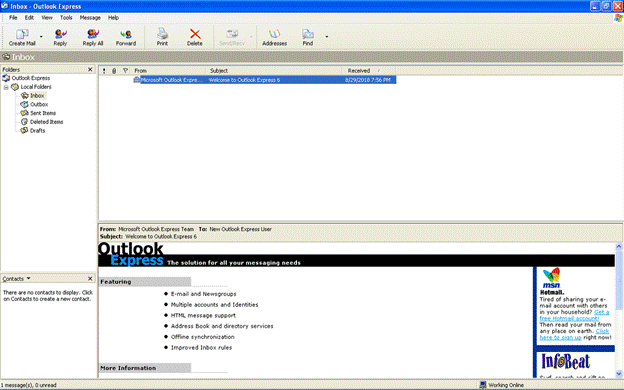
In the Windows 95 / Internet Explorer 3 days, there was a free app called “Microsoft Internet Mail and News” which combined internet email – POP3, IMAP4 – and the long-dead USENET newsgroup infrastructure based on the NNTP protocol. This was rebranded as “Outlook Express” even though it had nothing to do with the main Outlook application; the actual executable file for Outlook Express was still MSIMN.EXE for its whole life…
clip_image002

[Outlook Express … the solution for all your messaging needs…]

The Exchange Server that sat behind much corporate email added a web view of your mailbox back in 1996, called Exchange Web Access, later renamed Outlook Web Access and then Outlook Web App. As the functionality developed, so the old Hotmail.com service was rebranded Outlook.com, and the functionality of Outlook Web App for Exchange users and the free Outlook.com web client converged to a degree, as Outlook.com was moved to the same Exchange-based Microsoft 365 infrastructure.

Then there’s the mobile Outlook apps – Microsoft acquired email and calendaring companies Acompli and Sunrise Calendar, and folded their stuff into the highly-regarded Outlook mobile applications for iOS and Android.

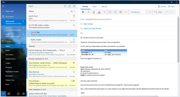
Finally, when Windows 10 released, there were built-in Mail and Calendar applications; in fact, it was the same application under the hood, but it could be started with different criteria which would set how it looked. This app is still available in the Windows Store and came with OG versions of Windows 11. If you delve back to August 2018 and Tip o’ the Week 445 – Finding Modern App names, you’ll see how to find out what “modern apps” are really called within the system; as it happens, under the hood, the Mail and Calendar app was … ms-outlook.
clip_image004

One Outlook to rule them all

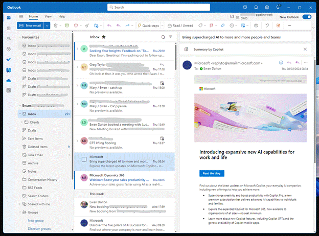
There has been a long held dream in Microsoft of having a replacement for the sometimes creaky old PC Outlook application and the Windows 10/11 Mail & Calendar app, to bring them together under a shiny new application. Sometimes known as “Project Monarch” or “One Outlook”, this new version will use web technologies to effectively be running Outlook Web App but with offline capability, on your PC or Mac.
clip_image006

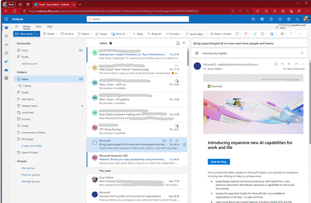
Spot the difference? The New Outlook above has lots of mail accounts added with different inboxes etc pinned to Favourites. Here’s the same primary mailbox in Outlook Web App:
clip_image008

The New Outlook for Windows has been available in preview for a while, and you might be getting nagged to migrate from Windows Mail to try it out, or if your M365 administrator hasn’t switched off the prompt, you could even be getting it in full-fat Outlook.

clip_image010

Having been in Preview for a while, Microsoft announced in September 2023 that this new client is now generally available, and was to be pre-installed on latest versions of Windows 11. By the end of 2024, the old Mail & Calendar apps on Win10/11 will no longer be supported and won’t be available in the Store anymore. It could be a long time coming to migrate desktop Outlook users to the new-fangled version, but the signalling is saying it’s happening someday.

Check those horses

By all means, have a play with the New Outlook – it’s actually pretty good, if you don’t get 10,000 emails every day; in fact, if you have several accounts, it does a better job of keeping on top of them all than old Outlook does (though, arguably, not as well as Mobile Outlook, which lets you see a single Inbox view of all accounts). If you decide to go for it, then you’ll still have access to the Old Outlook app as well (should you need it), and if you’re moving from Windows Mail to New Outlook and don’t like it then the move back should be smooth too.

But currently, there is a gotcha. And it’s the cold hand of license enforcement mistakenly stopping play.

Users of certain M365 subscriptions – Business Basic, or Exchange Online Plan 1 as two examples, are being blocked from using the New Outlook as their license supposedly doesn’t allow it. There is a confusion having a license for a piece of software, and having the rights to use your software against a separately licensed service.

If you look at Compare All Microsoft 365 Plans, you’ll see that Business Basic include “Web and mobile apps only” for Outlook; another way of putting that is “you don’t get the Office applications on your PC or Mac” by buying that subscription. But what if you had the actual software already, through another route? If you have a M365 Family subscription, you can install the Office apps on 6 machines, and there’s nothing stopping you from connecting to a separately-paid-for M365 Business Basic mailbox from your legitimately-licensed Outlook application.

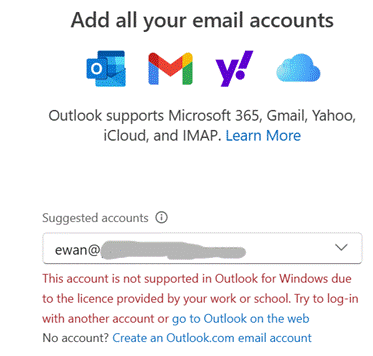
But New Outlook thinks differently. Trying to add a low-cost M365 mailbox gets you an unhelpful error:
clip_image012

Raise a ticket through official support and you’ll be told “you can access your mailbox by upgrading to a premium subscription”. The irony of “Add all your email accounts” is also not lost (especially since free services like Gmail, Outlook.com and Yahoo! seemingly have no problem), but penny-pinching paid-for Microsoft 365 subscriptions do.

Looking at the Exchange Online Service Description

clip_image014

The service that is being paid for should allow access from “Outlook for Windows”. Regardless of whether that means the full-fat Outlook app that you have to buy, or the freely available “New Outlook”, this document says you can access those mailboxes. But the New Outlook app is now enforcing something different.

Predictably, there are furious users on the internet. The Powers That Be have been made aware and are trying to think up an appropriate way round the issue, apparently. How about, don’t be a Doofus, Rufus? Excellent!
It’s baaaack… Tip OF the Week returns

OnMSFT.comOK, I said it was gone but it’s just been resting.

Tip o’ the Week is no longer the internal email in Microsoft, but was being published weekly on the OnMSFT.com site – as “Tip of the Week”…

[UPDATE – January 2024 – OnMSFT.com has been acquired by another site so may be transitioned, or disappear altogether…]

Tip of the Week #1: That function key most Office users don’t know about deals with function keys in general and in particular that shortcut to repeat the last thing you did in an Office app…

Tip of the Week #2: The OneNote addin everyone needs covers the shift to and from UWP apps and the benefit of moving back to OneNote’s traditional architecture due to the incredible OneTastic addin that is only available on that version.

Tip of the Week #3: Using Multiple Calendars in Outlook – Most people who use Outlook probably know that you can show multiple calendars at the same time, even overlaying them. But have you ever tried using the list view to show a table of appointments instead, so you can see everything that is coming up?

Tip of the Week #4: Calendar sharing using Bookings with Me – Microsoft has had a few goes at making it easier to share your availability with other people, from the basic Free/Busy in Outlook (typically within your organization) to tools like FindTime, which sends a poll to every attendee to get them to vote on the best time for them.

If you’re looking at offering your availability to others – especially if outside your organization – then the relatively new “Bookings with me” is worth a look. Think of it like Calendly but it’s part of (some) M365 packages…

Tip of the Week #5: Time management in & out of Windows – Did you ever have to call the speaking clock or set your watch off the clock at the bottom of the TV news? Fortunately, time setting in Windows is mostly automatic but here are some tips for how to tweak it, how to display other clocks and how to know what the time really is…

Tip of the Week #6: Managing Screenshots – SHIFT+WindowsKey+S is a supremely useful key combination; capturing parts of the screen with Snipping Tool and its numerous variants has long been a handy feature and as it gets updated, it’s getting better all the time.

Tip of the Week #7: Taskbar icons for Edge profiles (and other apps) – How to change the icon on your Win11 taskbar for different profiles of the browser, to make it easier to distinguish between them.

Tip of the Week #8: Juggling with Daylight Saving Time – Handling that awkward period where multiple parts of the world move into a different time, but not all on the same week…

687 – Loop de Loop

clip_image001Sometimes, new application paradigms disrupt the old ways of doing things – like real time messaging could sometimes replace email, or shared online document authoring takes over from working in offline silos. Just as software development methodologies and tools come in and out of fashion amongst the cool kidz, so too does the idea of doing everything online in a browser vs using those fusty old desktop apps that you might have installed.

One new application that springclip_image002 to prominence in recent years is Notion; it showcased a canvas-based approach to colloborative workspaces with components that could be shared and reused in an entirely browser or mobile app based environment.

Notion went from a small startup 10 years ago to a multi-billion valuation, despite initially fending off VC cash. The user base is supposedly skewed to teenage-to-mid-30s, though old timers like Paul Thurrott and the team behind the Windows Weekly podcast notably use Notion to manage the prep notes for each episode. He was initially less than complementary when Microsoft unveiled a similar-looking new service, born out of components of the “Fluid Framework” which been unveiled at Build in 2019 as a new way of doing co-authoring on compound documents.

Loop is the name given to this new Microsoft 365 collab tool, announced in clip_image003preview in 2021 and expanded somwhat shortly thereafter. It’s still a preview – some software companies have products in preview lasting multilple years, even if they don’t ultimately cark it.

Loop can be accessed at loop.microsoft.com either by using a “work or school” account as part of M365, or a Microsoft Account to sign-in to a personal version. Loop mobile apps now have support for personal accounts too. Admins in Microsoft 365 environments need to enable Loop for use – if you visit loop.microsoft.com as an end user and it’s not available, you’ll be told as much and asked to find your IT admin to get them to switch it on.

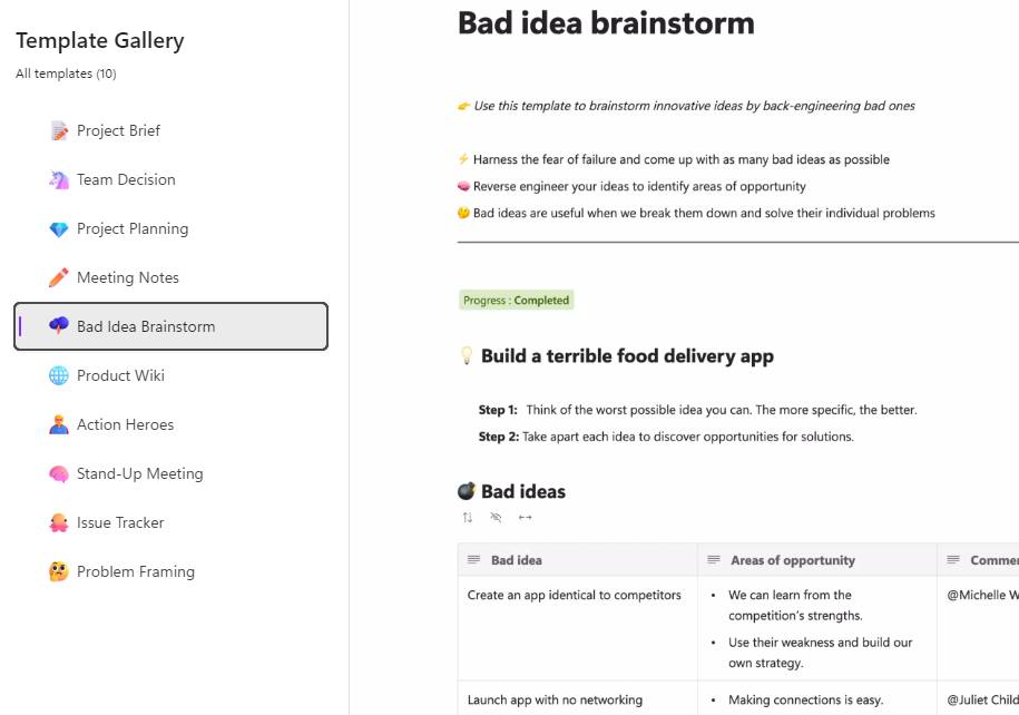
Loop components can belong to a workspace which itself has numerous pages – when you create a new page, you’ll see a selection of templates to get you started:

clip_image004

… and there’s a larger gallery which has more ideas, basically just pre-built pages with a smattering of ready-configured Loop components.

clip_image005

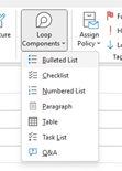
Inevitably, commentators compare Loop and Notion though one major difference is that rather than doing everyting in the online workspace, Loop components can also be shared and embedded within Office documents, emails or in Teams, which is arguably more flexible.

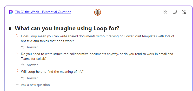
If you copy a Loop component to the clipboard and paste it into an email, you’ll see it embedded – though if using a table in your mail (such as is used in some weekly missives to try to control their layout), you’ll be disappointed as it appears you can’t embed Loop components inside a table.

clip_image007Create a new Loop component inside a mail or Teams session, and it won’t be part of an existing Workspace – it’s basically just an attachment but still offers multi-user capabilities. If you insert the component from the menu then it auto-creates the name assiged to that component and there’s nowhere that you can rename it within the email etc.

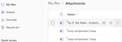
Head over to clip_image009OneDrive and look under My Files / Attachments, and you’ll see the created component – just click the ellipsis to the right and choose Rename from there, and it will show up with that name, wherever you embedded it.

Example:

Screenshot 2023-06-23 093135

686 – What’s that #:~:text?

clip_image002Hypertext was a concept first coined in the 1960s, inspired by an idea in the early 1940s as a way of thinking about organising information. The first practical implementations of Hypertext let a document or application reference a link to some other content, just as we now know web hyperlinks to do. It’s no wonder that when Sir Tim was conceiving the means of writing what came to be pages on the web, he envisaged hypertext – or even hypermedia – as the glue that holds it all together.

True hypertext documents or applications don’t just link pages to each other, but specific contents – it could be a fly-out or a pop-up with a definition of what a specific term was, or it might be a link that jumps into a particular part of a longer document.

clip_image004

Many web pages have bookmarks defined within – eg Wikipedia typically has links on the left side which jump to parts later in the document, and the bookmark is added to the end of the URL – like https://en.wikipedia.org/wiki/Hyperlink#HTML

Office docs offer similar things – Word and Outlook have Bookmarks, PowerPoint can have hyperlinks inside slides that jump to a different slide etc.

If you look at documents stored on OneDrive or SharePoint, it’s often possible to create a link directly from within the full fat Office application, to a part of that document – eg clip_image006in PowerPoint, right-click on a slide in the sorter view and it will display a URL to that specific slide, that you could share or link from elsewhere.

When dealing with web pages, there are some other tricks you can do to jump straight to a part in the page, even if that page itself has not defined the bookmarks for you to reference like the Wikipedia one above. The WWW Consortium fairly recently defined a standard for handling “Text Fragments”, which means you could link to a specific phrase on a page. Clicking the link will navigate to that point on the page and highlight the text. This is done with a strange looking tag at the end of the URL: #:~:text=whatever.

Example: one of the most-visited articles in the TipoWeek archive, Killing me Softly, part I (a wistful post looking back at some of the Microsoft tech which has ceased to be) has a part which deals with the audio file format, Windows Media Audio – see it on https://tipoweekwp.azurewebsites.net/2016/10/21/tip-o-the-week-350-killing-me-softly-part-i/#:~:text=Windows%20Media%20Audio.

clip_image008Handily, if you want to generate a link straight to a word or phrase on a page, both Edge and Chrome offer a feature if you right-click on some text on the page – it may use other text fragment features to help steer to this specific piece of text, rather than just the first time that phrase appears on the page. See it in action, here.

685 – Browser searching

Screenshot 2023-06-06 181351Research from a couple of years back showed that the most-searched-for term on Bing.com was “google”. While it seems crazy that people would type the name of a search engine into the search box of another, it’s possible they were entering “google” into a box on their homepage or even in the browser address bar, and that term was sent to bing.com as a query, rather than sending the browser to google.com.

If you’re using Edge and have Bing as the default search experience – other search engines are available – then you may see the prominent search box in your new tab page, but it’s worth remembering that the address bar at the top of the browser is also a search box. You can jump to the address bar in Edge or Chrome by pressing ALT+D, which also selects the current site’s URL (if there is one) so you can edit it or just replace by typing something else.

clip_image004If you start putting the name of a site into the address bar, you’ll be offered autocomplete suggestions from your favourites and your previous browsing history, so it may be very straightforward to jump to not just the website but a specific and previously accessed page within.

Entering a site name and pressing CTRL+ENTER will add the https://www. and .com bits so you don’t need to; therefore, to go to the BBC website, you could press ALT+D bbc CTRL+ENTER and you’d go there directly.

Although the address bar will ultimately use your default search engine to query a word or phrase that doesn’t appear to be a web site address, you can force it by starting to type ? in the address bar, then enter your search term after the question mark.

clip_image006Some sites will allow the browser to search within them by adding the site name and then pressing TAB. Whatever text you enter after the TAB will be sent to the specific search page of that site. Not all sites support this method, but many common ones do, like Twitter, Amazon, YouTube and more.

clip_image008Go to the search engine settings in Edge (or jump to the address bar and enter edge://settings/searchEngines) to see which sites are set up already. You can add your own “search engine”, which means you can direct Edge how to search within that site.

Click Add to include one of your own, using the appropriate site URL while replacing the bit where the search term is specified with %s – eg searching the OneDrive photos section for “dogs” would give a URL of https://photos.onedrive.com/search?q=dogs.

Give the Search Engine a shortcut name you want to use and then paste the modified URL and hit save. Now, in this example, typing photos | TAB | cats | ENTER would seach OneDrive for cat pictures.

If you are a Microsoft 365 user then you might be able – if it’s been enabled for your tenant – to search internal work documents and Sharepoint sites, just by typing work | TAB | etc. It’s on by default, but admins could also give you custom keywords / shortcut words too.

clip_image010Finally, on the topic of Searching in the browser, it’s possible to search across all the tabs you have open; start typing something in the address bar and you’ll see the option of filtering that search to apply to Work, history, favourites or tabs.

clip_image012Alternatively, press CTRL+SHIFT+A to kick the search off, type in the word of phrase you’re looking for and it will filter the list of current tabs to show only ones that match.

To quickly jump to that tab, use the up and down keys to select the one you want, and press Enter.

683 – OneNote Docking

imageSince the OneNote desktop app is getting a reprieve from its previously-announced retirement, and the anointed successor UWP app is itself being put on notice, maybe it’s worth looking at a few tweaks which can make the old app a bit more useful. There were a load of updates announced about a year ago, and further improvements to the OneNote family are on the way too.

If you use OneNote to take meeting notes – especially if you’re meeting virtually and want to have your notes alongside the Teams/Zoom/Chime app – then it makes sense to arrange the windows side by side. Students of ToW past will know that in Windows 11, pressing WindowsKey+ ‎← or → will snap the current window to the sides of your display, and there are other ways to control window placement if you have especially complex desktop arrangements.

clip_image002clip_image004There is an old feature in OneNote which is worth revisiting; Dock to Desktop. Invoke it at any time by pressing CTRL+ALT+D or go to the View tab to select it.

You could also try pinning it to the Quick Access Toolbar on the very top left of the OneNote window. The QAT in Office apps was covered way back in ToW #321, from March 2016.

clip_image006Docking has the effect of minimizing the UI for OneNote and sending it to a (horizontally resizable) section of your screen, on right-hand-side.

Usefully, it also means other apps respect that space, so even if you maximize another window, it will only grow to appear alongside your docked OneNote.

clip_image008

If you don’t like the position of the docked window, drag it using the “…” at the top of the pane, and position it on the top, bottom or the left side of the screen instead. If you press CTRL+ALT+D again while docked, it will fill the entire screen – maybe useful if you have a 2nd monitor.

The rest of the minimal UI lets you access the pen menu, restore back to the full UI or you can use a somewhat obscure feature called Linked Notes. This will add a link back to another clip_image010document that you could also be working on; you’ll see an icon showing the source document when you select text that has been linked.

Hover over the icon and you can get a summary or thumbnail of the document, and left-click the icon to open the document.

The original intent with Linked Notes was that you could use it across Office apps and also when browsing the web; how useful to be able to make notes on a specific web page and then jump back to the source when revisiting the notes you took! Sadly, the feature was integrated only to the dearly departed Internet Explorer, and it is not available in modern browsers. The topic of Edge support has been raised in online forums but thus far, responses have been less than forthcoming.

Even the Help page on Linked Notes talks about how it works with Word 2013, PowerPoint 2013 and other OneNote 2013 pages… no mention of Excel either.

clip_image012If you do find yourself going back in time and using Linked Notes, you’ll see an additional icon (when un-docked and back in full OneNote mode) in the top right of any page where you have links, allowing you to go straight to the source docs or to manage the links themselves.

682 – Lens scanning

clip_image002

Continual advances in the quality of smartphone cameras mean that most people don’t use a physical camera any more; unless you are really demanding when it comes to control over digital imagery, phone cameras are good enough for most people, most of the time.

Compact cameras have evolved too, providing phone-beating snaps through better sensors and lenses than could possibly fit in the body of a handheld communicator. More light hitting a larger sensor through a bigger, higher quality lens gives you a better starting position to get a decent picture, though smartphones have powerful software and – increasingly – cloud services available to help improve the photo after it’s been captured. Higher-end cameras are changing, too – even Hasselblad (famed for moon shots but also for the most famous photo of the world) is ditching the DSLR model and going mirrorless. The horror!

clip_image004Marrying high-resolution imaging with powerful software in the palm of your hand does give you access to new capabilities that a generation ago would be almost unimaginable science fiction.

clip_image006Check out Plant Viewer to identify which is weed and which is flower, or Google Lens to capture information from the camera or even just to try to identify whatever you’re pointing it at.

As the world has discovered with ChatGPT and Google’s Bard, responses from AI powered services are not always quite correct, even if they appear convincing.

As any fule kno, this item in question is in fact a Seiko RAF Gen 2 (not a Gen 1), even though Google successfully found one for sale, that looks identical.

Google Lens is available on iPhone and iPad too, and depending on the Camera app you use on Android, it might also be launched clip_image008from there (and most Android devices will launch the Camera app if you double-tap on the power button, so it’s a quick way of getting to Camera, even if the device is locked).

Microsoft Lens is one of the best “Lens” or scanning apps in either mobile store (Fruity | Googly). Formerly “Office Lens”, at one point also available as a Windows app (but now discontinued) and since rebranded somewhat by its listing in the mobile app stores as Microsoft Lens: PDF Scanner, though it can do lots more.

The premise of Microsoft Lens is that clip_image010you can point the camera at something and scan it, by taking a high-resolution photo of the thing and then using the software to manipulate, crop and adjust the image. The most obvious use case is scanning a Document; start the Lens app, lay the doc out as clearly as you can and then step through grabbing each page in turn.

clip_image012The red > icon in the lower right shows how many pages have been captured so far. In earlier versions of the Lens app, you’d try to frame the page at the point of capture but now you just grab the images one-by-one (using the big white button) and do the tidying up later.

Press that red button and you’ll go to the UI where Lens tries to identify the corners of each page, and lets you tweak them by dragging the points. You could retake that individual image or delete it from the set of captures.

Press the confirm button on the lower right and you’ll jump to a review of the captured images, giving the option of rotating or adjusting each one, cropping, applying filters to brighten and sharpen them and so on. Once you’re happy that you have the best-looking images, tap on Done to save your work.

clip_image014You could send all the pictures into a Word or PowerPoint doc, drop them all into OneNote or OneDrive as individual files, or combine all the “pages” into a single PDF and save to your device or to OneDrive.clip_image016

There are other tools on the primary screen of the Lens app, too, if you swipe left to right. The Whiteboard feature lets you grab the contents off the wall and applies a filter to try to flatten the image and make the colours more vibrant.

There’s a Business Card scanner which will use OCR to recognize the text and will drop the image of the card and a standard .VCF contact attachment into OneNote, ready to be added to Outlook or other contact management tool.

The Actions option on the home screen gives access to a set of tools for capturing text and copying it to other applications or reading it out. There’s also a QR code and barcode scanner too.

clip_image018One somewhat hidden feature of Lens could be particularly useful if you’re sitting in a presentation and want to capture the slides for your notes.

clip_image020Start the Lens app, and instead of using the camera to grab the contents and then faff around trimming them, tap the small icon in the bottom left to pick images from your camera roll. This way, you could just snap the slides quickly using the normal camera app and do the assembling and tweaking inside the Lens app, later.

This photo was taken on a 4-year-old Android phone, 3 rows back from the stage at an event using the Camera app with no tweaks or adjustments. It was then opened in Lens, which automatically detected the borders of the screen and extracted just that part of the image into a single, flat picture.

clip_image022That logo on the top right looks familiar…

For more info on Lens, check out the Android and iOS support pages. Oh, and it’s completely free.

676 – Calendar spring cleaning

clip_image002

As spring continues to emerge from its wintry slumber in the northern hemisphere, it could be worth spending a little time tidying up your Outlook calendar as well as spring cleaning your nest. The following applies to Outlook on the PC, though similar colour-coding concepts exist for Outlook Web App and on other platforms.

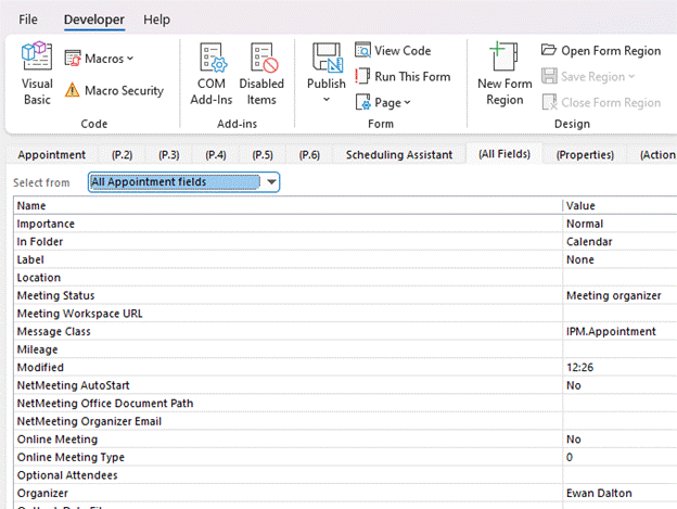
You could start by looking for “Ghost meetings” – those are ones where you’re the organizer, but none of the invited attendees have accepted your invitation. A good example is a 1:1 meeting when the other party is on holiday – they might have declined a meeting but you left it in your calendar.

clip_image004To quickly view Ghost (or maybe Zombie?) meetings in your calendar:

  • Download this ZIP file and open the downloads folder where it is saved.
  • Right-click the ZIP and choose Extract All then right-click the resulting file and Unblock it, so Excel will let you run the macro within (don’t worry, it’s perfectly safe). clip_image006
  • Now open the file in Excel. If asked, tell it you want to edit the file and allow macros to run, then hit the Scan Calendar button. You’ll now get a list of meetings to go and delete, or possibly to nag the invitees to respond.

clip_image008

Another trick is to colour-code your appointments, either by setting categories on them individually or by using rules. This way you could quickly differentiate an appointment (ie something you put in your calendar to block out time) from a meeting (ie an appointment which you invited others, or to which you have been invited).

clip_image010Setting a colour category is a quick exercise once you have the categories defined – right-click on an entry in the calendar to pick a category, or you can set it from Categorize option on the Ribbon while creating or editing an appointment or meeting.

Rules are set by creating instructions that apply to the view you’re using; go to the View menu on the ribbon and choose the View Settings menu item.

This presents a somewhat old-fashioned looking clip_image012dialog box which lets you change the view, including using Conditional Formatting, where you define rules that will mean the select colour applies.

clip_image014

In “My Meetings”, if your name is the organizer, then the meeting shows as green.

Explore the conditions dialog a little and you’ll see all kinds of things you can filter by. It includes a powerful advanced mode that will let you set a condition on any property of the meeting or appointment (so you could have different colours for meetings whose locations were in different buildings etc).

The “External meetings” condition above does require further hoops to be jumped through to get it set up, but it’s a one-and-done exercise. It involves adding a custom form to Outlook, which in turn exposes a new property called “Sender clip_image016Address Type” – if the value is SMTP, that means the message – or calendar meeting request in this case – came from outside, so you’ve been invited to a meeting organized by a 3rd party. The same field could be used to colour code your inbox so as to prioritize emails differently too.

To see how you could use the Sender Address Type to alter how your inbox is displayed, and for the instructions on how to install the form so that field becomes visible to Outlook, crank up the time machine and head back to Tip o’ the Week #275 – Prioritising External Email – Ewan Dalton’s Tip o’ the Week (tipoweek.com). Great Scot!

675 – Does size matter?

clip_image001

When disk size was measured in Megabytes and network bandwidth even less, size of files really mattered. When non-floppy floppy disks were sized in 1.something MB, IOMega Zip drives promised 100x as much storage for only a few times the outlay.

The dramatic growth in capacity and drop in cost of storage has radically outpaced Moore’s law, where a gigabyte of disk storage might have cost $100 in 1997 and only $10 by the year 2000. Nowadays, if you bought your gigs on a spinny platter, they’d cost you less than $0.01 each. For most end users, solid state storage has largely replaced the traditional hard disk and even with 10x performance, the price is still only a few cents per GB.

That said, storing data in the cloud costs money over the long term, and has a potentially negative environmental impact – a Stanford report from a few years ago estimated that saving and storing 100GB in the cloud for a year costs the equivalent of 0.2 tonnes of CO2, or about the same as a one-way flight from Seattle to San Francisco. So reducing unnecessary cloud storage can be worthwhile.

clip_image003

If you’re writing an email in Outlook, you can see the current size from the File | Info menu.

clip_image005In Word, Excel and PowerPoint, you can see the document size and other useful info in the same place (varying details depending on which application).

A previous Tip dealt with the scourge of bloating PowerPoint files, where it’s not uncommon to have unnecessary large images lurking within the template you’re using, but there’s a simple trick that’s common across all Office apps – compressing picture size.

clip_image007Especially if you’re embedding photos from a phone or even screen-grabs from a high-res display, individual files can be in the multi-megabyte* category. In many cases, you might resize your image so doesn’t take up such a huge part of your document, but the app will still be storing the full resolution of the image – including any bits you’ve cropped out – behind the scenes.

To compress pictures in your document – and let’s use PowerPoint as an example given that it’s the chief culpritclip_image009simply select an image and in the Picture Format menu which appears, choose the Compress Pictures option.

This will let you determine the level of detail to keep for this image – if it’s a simple presentation, then it probably doesn’t need a very high definition picture. You also select whether to keep or discard any cropped areas, and importantly, whether to apply to just this one or by clearing the top option, applying to all images in the file.

Try taking any large PowerPoint file, delete cropped areas and apply Web or Print resolution to all images, and you might see it drop to 10% of its previous size.

clip_image011

The Compress Pictures option is also available from the folder picker in the old File | Save As dialog, and there are other options to change the default resolution available from within the File | Options menu.

*Remember kiddos, there are 1000 MB in one GB; smart alecs might believe that a kilobyte would be 210 bytes – 1024 – but for 25 years international standards have defined that as a kibibyte or KiB, trying to assert with less ambiguity that a kilobyte is actually 1000 bytes, therefore a Gigabyte is 1,000 x 1,000 x 1,000 = 1,000,000,000 bytes, whereas a Gibibyte – srsly – is 1,0243, or 1,073,741,824 bytes).

674 – Here’s the (co)pilot

imageUK telly viewers in the early noughties may recall the surreal comedy show, Trigger Happy TV, with recurring characters like the aggressive squirrels or the  guy with the massive phone (and that Nokia ring tone).

It was also known for some great soundtracks, like the fantastically titled Grandaddy song “He’s Simple, He’s Dumb, He’s the Pilot(also used elsewhere). Tech news over recent weeks tells us that the pilot – or Copilot – is anything but dumb, even if it can be simple.

clip_image002For Microsoft watchers, “Copilot” is a growing set of capabilities which are being built to add OpenAI functionality to other applications. With all the hoo-hah about ChatGPT and the generative AI that is now integrated into Bing (and available for everyone who wants it, not just early adopters), it’s easy to get different strands mixed up.

GPT-3 and now GPT-4 are the core language models which could underpin any number of applications’ use of what looks like artificial intelligence. ChatGPT is one web app built to hone some of the parameters of GPT-3 and put a chatbot front end to it. The new Bing and all the other stuff announced over the last few weeks is not using ChatGPT, but they do share some of the same technology underneath. Capisce?

There have been AI features aimed at making developers’ lives easier, such as Github Copilot (available since 2021), which uses another OpenAI tool called Codex, itself built to harness GPT-3. For developers on Power Platform, there have been AI functions for years too, though some capability has been recently added.

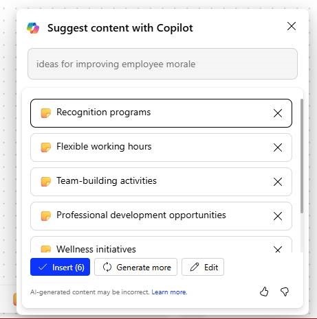
Everyday users of Dynamics 365 and Office applications will soon get Copilot capabilities to help automate boring tasks, like “work”. Do bear in mind that announcing something and making something available – in limited preview form or generally – are different activities. Copilot for Office apps like Outlook might be a few weeks or months away for most of us, but who can’t wait for AI to automatically read and reply to all their emails?

clip_image004

The future with our robot overlords never looked so appealing.

For a growing summary of Copilot announcements, see the hugely popular LinkedIn post from Jack Rowbotham.