 Even after 2 years of mostly enforced remote meetings, it’s still amazing how many people have yet to master some of the basics of online meetings – like management of the mute button and general audio interference, positioning of screen/camera so you’re not looking up their nose or side of their face, professing to having bandwidth issues as the reason for not enabling video, and many more. One “room for improvement” function is that of presenting PowerPoint slides and not looking like an idiot. Even after 2 years of mostly enforced remote meetings, it’s still amazing how many people have yet to master some of the basics of online meetings – like management of the mute button and general audio interference, positioning of screen/camera so you’re not looking up their nose or side of their face, professing to having bandwidth issues as the reason for not enabling video, and many more. One “room for improvement” function is that of presenting PowerPoint slides and not looking like an idiot.
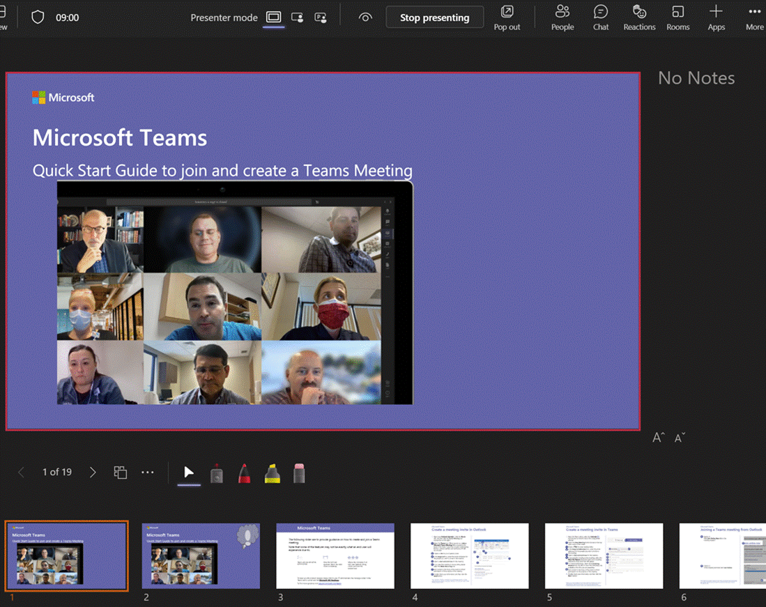
Don’t share your screen to present slides in Power Choosing this opens up a Presenter View akin to the one in PowerPoint, which is the default if you have multiple monitors and you start a Slide Show. This view lets you see Speaker Notes, jump quickly to specific slides rather than paging through them, and be more interactive with the meeting than you could ever be if you were simply sharing a screen showing a PowerPoint slide on your computer.
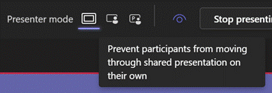
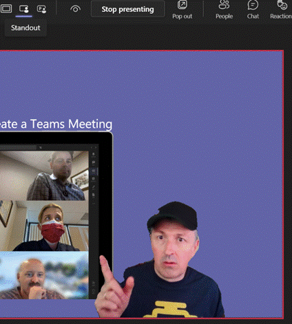
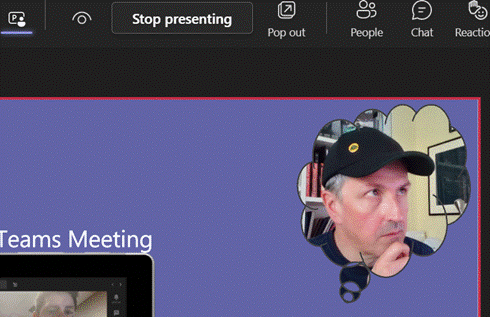
Next to that icon, there are some others which define the presenter mode – Content Only on the left, shows just the slide you want. Next to that is Standout, which takes your video and overlays it onto the slide rather than having it appear as one of the surrounding gallery A downside of the Standout mode is that you don’t get to control where your image goes on screen, or how big it is – so you might well obliterate some part of the content you’re presenting. This new feature gives you a way to solve that. In PowerPoint, go to the Insert tab and on each slide add a Cameo (or a Camera as the object it creates is described in some controls), then place and size it as you want. If you select the new object, the Camera tab will give you more customization options.
You will need to add a Cameo to every slide you want to show up on – potentially useful if you want to only appear for intros and Q&A but perhaps leave the content on its own for other parts.
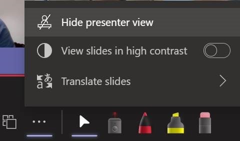
Using Pop Out might help if you have a larger second screen connected, though chances are you’ll be using the camera on a laptop so ideally want to be looking at that display. Since nobody really uses Speaker Notes anyway, you could try Hide presenter view, which means you’ll lose the slide thumbnails and speaker notes, but still keep the other controls. Go to the View control on the top left of the window and choose Full Screen to increase it even more. For more details on using the new Cameo feature, see here – it is in preview which is rolling out through Office Insiders first so you may not see it right away. If you are presenting using simple app or desktop sharing rather than the PowerPoint Live model described above, there are some other options in how you appear alongside your content. As well as launching the PowerPoint Live sharing from within PPT itself, you can choose to share recent presentations while in Teams – just scroll down past the various “share screen / app” options and you’ll see more. This topic was covered previously on ToW #576. |


