#43: Designing Everyday Things

clip_image002

Design is everywhere in the things we have made. Intentional or inherent, every object is that way for a reason. Whether an item’s design is primarily to make it easy and obvious to use (see Bic), just to look amazing, or for some amalgam of form and function, we often know it when we see it. Sir Lord Kevin McCloud has made a career of pointing out things that have been done well, or perhaps have not.

Some of the best designed things, however, are impactful because we don’t notice the effort that has gone into them; the designer thought hard about it, so the users do not need to. It’s no accident that 3 of the top 10 in Fortune’s updated “100 Best Designs” list originated at Apple, where Steve Jobs placed good, user-centric design and “taste” at the heart of what they do.

In 1988, a seminal book on aspects of product design thinking was published, “The Psychology of Everyday Things”. It later changed to The Design of… as bookshops and libraries were apparently lumping it in the wrong category, it being more about how products should be designed rather what makes us inherently tick.

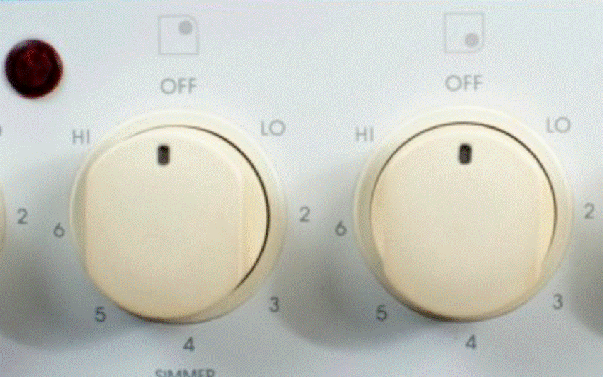
A few examples highlighted in DOET of things that could be done better include the physical layout of light switches and the lights they operate, or knobs on a cooker vs the position of burners or hotplates they control.

Often the controls are in a straight line across the front of the cooker, but the elements or flames are in a square. To make it easy for you to know which knob works which heatsource, a simple and obvious symbol is positioned nearby. Better hope those don’t wear off over time.

clip_image004

Wouldn’t it be easier for the end user if the knobs were placed in the same pattern as the burners? That way, you wouldn’t need a symbol to inform you; instinct would make you start with the correct one (assuming you were paying some amount of attention).

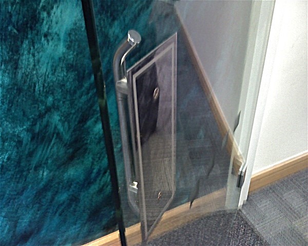
Another example is door furniture. On the types of corridor doors which you’d find in offices or public buildings, it’s not uncommon to put a handle on the door. Instinctively, you will grab a handle if offered it, and the first thing you’ll do is to pull it (as DOET puts it, that is the action which the handle affords you). That’s fine if the door opens towards you (or swings both ways), but if not, you’ll instinctively pull it first before realizing it doesn’t move and therefore needs pushing.

clip_image005

Similarly, if all the door shows is a blank pad, you’ll open your palm and give it a push. No need for a sign to tell you what to do (well, unless you’re from Midvale).

clip_image006

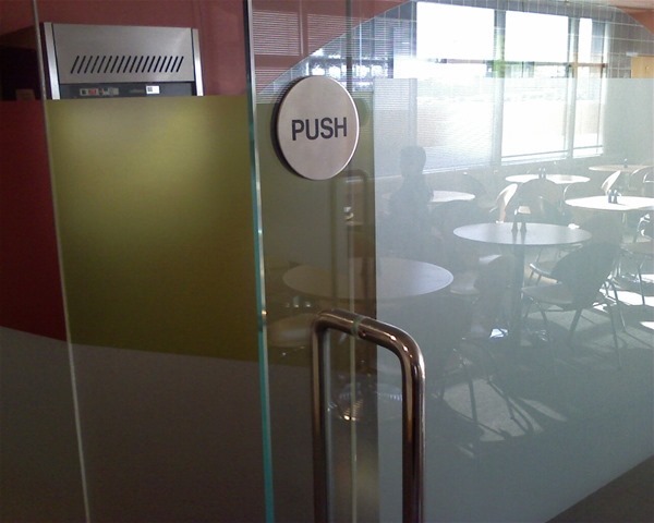
Aesthetically, glass doors might look better with a handle on both sides but function over form should mean they’d look better still without a push/pull sign, and they’d be easier to use.

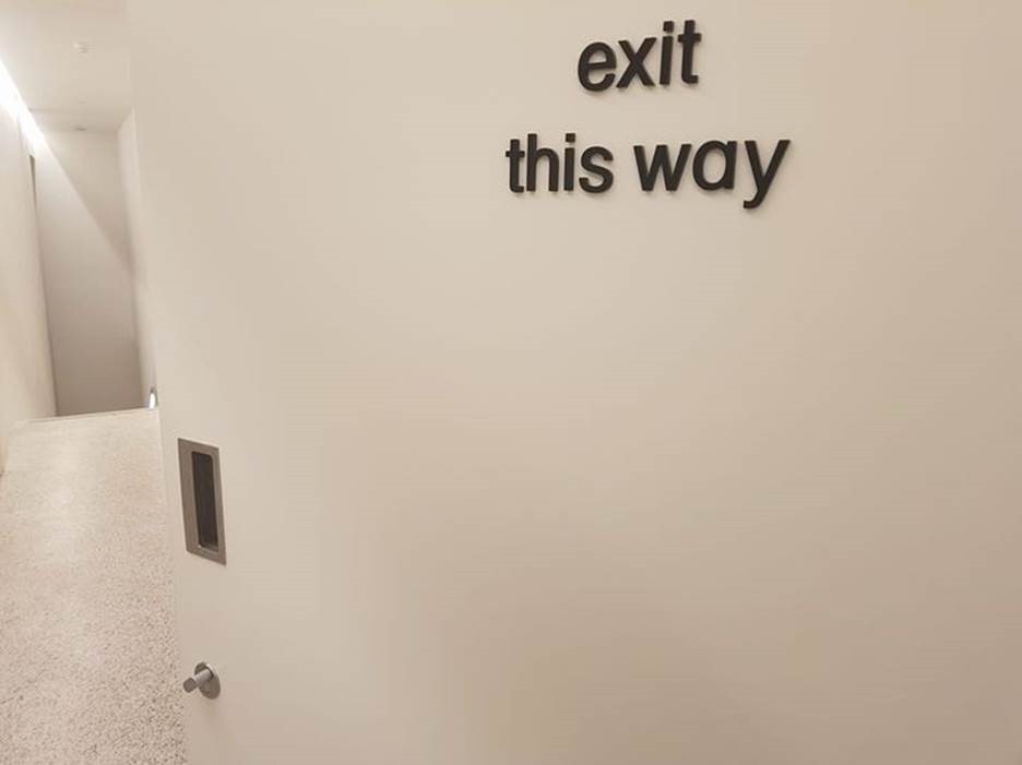
Even London’s Design Museum falls foul of the odd rule now and again…

eclip_image008

A grab handle, on a push door? Sacre bleu! (in mitigation: it looks like the handle could be used to pull the door shut to lock it, but still…)

The DOET book has been updated a few times in its life (since its re-identifying from POET) and is highly recommended.

Controlling everyday software things

For a 20-year-old tome on poor software and UX design, see The Inmates Are Running the Asylum: Why High Tech Products Drive Us Crazy and How to Restore the Sanity. Written by Alan Cooper, “Father of Visual Basic” and respected author on interaction design (a nuanced idea, as opposed to interface design), it’s a fascinating insight into design thinking in a software age.

An example given is of designing the user interaction for an in-flight entertainment system; developers will often institute fiddly directional cursors, modal buttons, controls that need to be labelled so you know what they do. Cooper replaced most with a simple rotating knob; the user will quickly figure out what happens when they turn it right and left. Push the knob to select something, maybe add a Back button and you’re pretty much done.

Bringing things up to date, even though a lot about software and interaction with technical systems could be improved, a great deal of effort is put into simplifying things and trying to remove extraneous UI elements.

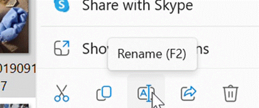
clip_image010 Icons, of course, have their own life – there’s that meme about kids thinking that a 1980s 3.5” floppy disk is a 3D printed save icon. At least if you hover a pointer over most icons, you’ll get a pop-up to tell you what it is.

Windows 11 made some controversial changes to things that power users knew and liked, but for most people they just get used to it and if they ever had to regress to an earlier version, would probably admit they liked the newer one better.

Too many options

The Right-click menu in Windows Explorer has long been cluttered up with lots of options; software you install would add an item to make it easier to operate on that file (Share with Skype! Edit with ClipChamp!). In Win11, many of the lesser used ones were moved to a secondary menu supposedly to leave only the mainstream stuff behind…

clip_image012

Clicking the Show more options menu item (with an icon which looks like making a window bigger) will display the old-school Windows context menu which could easily have 30 or 40 things on it.

Back on the “Fluent” Windows 11 context menu, the very most used options – cut, copy, rename etc – were promoted to icons at the very top or bottom of the menu, and for lots of users promptly disappeared from view.

clip_image014

This is something which is going to be updated in a soon-to-be-released update, to make it easier to use…

clip_image016

Control Panel Still Alive

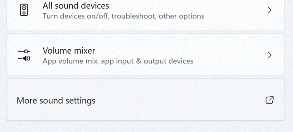
Microsoft is still working on replacing some of the last vestiges of old Windows code, just one example being the Control Panel. A key part of Windows ever since version 1.0, it was where you tweaked anything to do with the operating system or the PC. Since Windows 10, most of the key bits you’d configure using Control Panel were migrated to the Settings app but even today, there are some bits of the UX where you’ll fire up an old-fashioned looking Control Panel applet … often buried in the “Advanced” part of Settings, and identified with the square-thingy-arrow-up-right icon, which we learn to know means opening something new…

clip_image018

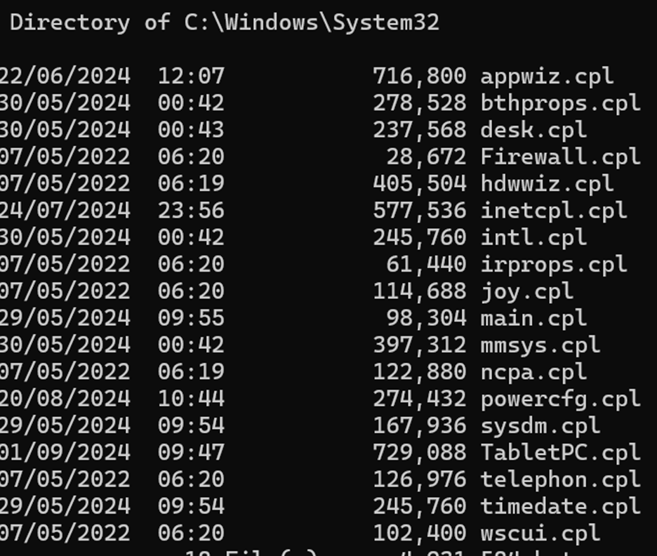
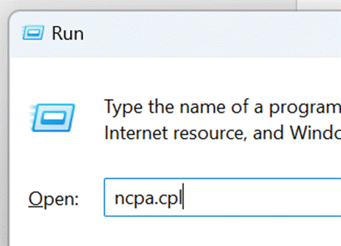
These Control Panel “applets” which remain in Windows can be found by looking in the System32 folder – to invoke any of them just to see what they do, press WindowsKey+R then enter the name of the .cpl file and prepare to be amazed and/or confused.

clip_image022

clip_image020

Gradually, though, these CPLs are being replaced – see desk.cpl – with enhancements to the Settings app, but there’s still life in the old control yet…

clip_image024

expand the Control Panel section in System configuration tools in Windows – Microsoft Support

#9: Go for a walk

Hello, ToW readers! It’s been a few couple of months now since the recent yet erstwhile host of “Tip of the Week” was acquired and their new owner has thus far not completed the repurposing of their content, and therefore not given me confidence in writing any more for them, for now. In the meantime, I’ll continue to dribble this stuff onto LinkedIn each Friday (as Tip o’ the Week always was, in the days when it was a Microsoft internal email), following from the restarted numbering system as at the time it changed from Tip o’ to Tip of.

I do hope you enjoy. Yay.

Now that we’re finally in the grip of the New Year, some NY resolutions might have been sacrificed already; eating less, moving more, not drinking too much and the like. If you’re still keen, maybe each weekend, why not get out into the great beyond and go for a walk?

Step 1 will be to decide where you’re going to walk to. Technology provides lots of help in that regard – from local website guides offering “10 great winter walks to take in your area” type articles (typically stuffed with clickbait and stupid advertising, though), to mobile apps and web sites like MapMyWalk, AllTrails and Visorando. Community enthusiasts might post their favourite routes on these and other fora, possibly with reviews to tell you how muddy they are / how many angry bulls you might encounter etc.

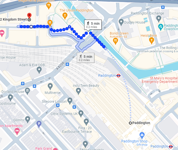
Screenshot 2024-01-12 134756If you like the good old method of staring at a map and making up your own way, there are all the usual mapping tools available too. Google Maps clearly has a market share leadership position, and offers handy offline capabilities and walking directions, which sometimes include off-road footpaths as well. Not bad if you’re mostly in a built-up area, but once you’re in the sticks, you might be better off with more tailored alternatives. If you’re walking in London, check out Footways – a site showing a curated set of suggested “quiet” routes from A to B.
Apple pushes their alternative mapping software for Fruity device users, however if you follow a link to an Apple Maps location – eg https://maps.apple.com/?q=47.641944,-122.127222&t=k – and you’re not on an Apple device, it will send you to Google Maps instead. DuckDuckGo lets you view the map using another browser – eg https://duckduckgo.com/?q=47.641944%2C-122.127222&iaxm=maps – in case you feel like you’re missing out. [You’re not, btw]

If you’re planning a walk in the UK countryside, you’d do well to look at Ordnance Survey, a government funded department which publishes maps at varying scale and with key attributes highlighted. The organization dates back to the 18th century, set up to accurately map England in order to counter military incursions from troublesome neighbours. They still produce not-insignificantly-priced paper maps, however pinch-to-zoom is somewhat problematic on such offline media, so a mobile subscription based app with route planning, offline guidance and the like might be more fitting (and they have a 30% offer on annual subscriptions right now).

If you’re not inclined to subscribe, there is one alternative that’s useful when planning walks, even if you need to print the map out (or screen grab it to save the image to your phone): use Bing Maps.

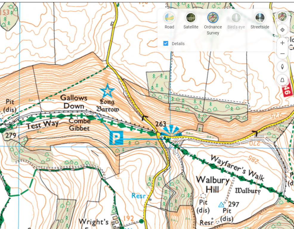
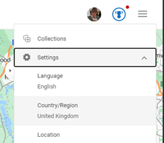
Screenshot 2024-01-12 144611It’s easy to forget about Bing Maps (jump to bingmaps.com in a browser to get there quickly) since there’s no workable mobile solution, so most people will rely on the other main platforms. If you’re in the UK, however (and you set United Kingdom as your region in the hamburger menu on the top right) then you’ll be able to access Ordnance Survey mapping for free.

Look at the “Style” icon near the top right and you can choose road maps, satellite view and more, including Ordnance Survey. If you don’t see that option, you will need to play some more with your location settings. Zoom in or out until you get the right level, and you’ll see Explorer (slightly more detailed) and Landranger map views, showing key attractions with public footpaths marked.

Screenshot 2024-01-12 144928

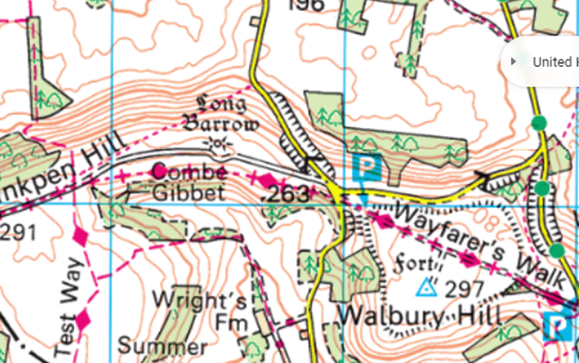
Screenshot 2024-01-12 150614It’s brilliant. Right-click the map to use the measuring tool to draw your walk and calculate the distance. Screen-grab (WindowsKey+S) the section you want, and you could highlight your route from within the Snipping Tool before printing it out, nice and big and easy to read.


663 – Optimize Edge start screen

clip_image002Happy New Year! Do you have any resolutions that you’ve decided to follow, other than the usual (eat less, move more, try all you can to write 2023 instead of 2022)? How about cleansing your web browser start up screen to something more useful and/or less distracting?

With the Edge browser, the default New Tab Page (or NTP) presents a configurable and sometimes useful way to display information, however the source of news articles and the advertising that is shown alongside can sometimes be, er, challenging.

Clickbait

Third party advertising aggregators take sponsored content from an originator and present it as an advert. This presents a problem for the sites that choose to sell advertising space – in tiles mixed with legitimate sources in the likes of the NTP, or in chumboxRecommended for You” type content at the bottom or side of articles.

Some of the ads often lead users to a site which will do more than try to sell them something – some try to get them to install browser addons, show faux review sites recommending dubious-at-best products, or fraudulently push get rich quick schemes and the like.

clip_image004If the originator keeps foisting nonsense adverts with poor quality visuals and clickbait headlines through the aggregator, the content owner who relies on the revenue stream from the ads can complain and have it blocked – it doesn’t do their reputation any good if their site is littered with stupid adverts.

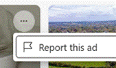
clip_image006Ad blockers don’t work on the Edge new tab page, but you can report a dodgy ad by clicking the ellipsis on the top right of the tile. Or submit a report here. This is a whack-a-mole game in a modern sense, since even if the original is blocked they may just appear the next day on a different URL but with substantially the same garbage content.

If this kind of insidious spam drains your energy, there are things you can do to minimize or remove the nonsense, even without switching to a different browser.

clip_image008Looking at the Edge NTP, if you are using a browser profile signed in with a Microsoft 365 account, you might see “Work” or similar in the Enterprise page; it’s extremely useful and quite customizable, and administrators could make Edge default to that tab. If users click on My Feed, they’ll get the same view as a non-Enterprise tab, and it will stick for that user on the next new tab.

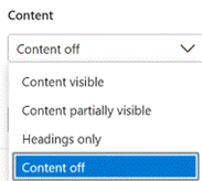
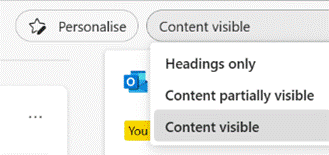
clip_image010clip_image012You can customize the “My Feed” section by choosing to Personalise your content selection and how you want it laid out, but if you want to switch the whole lot off altogether then look on the settings cog on the top right.

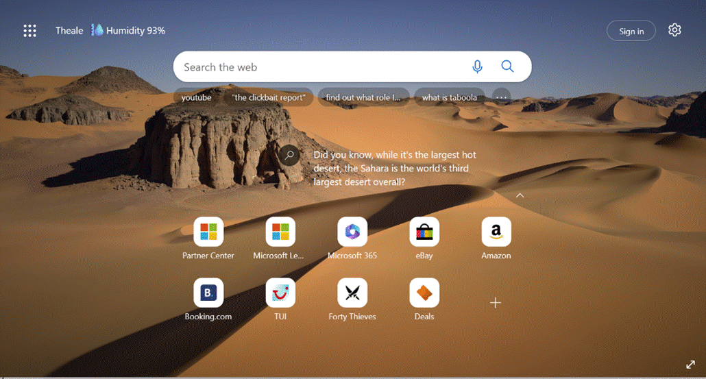
Switching the clickbait off will mean you get a beautiful Bing image taking up most of the screen (click the double-headed arrow on the bottom right to find out what it is), with a search bar and some collapsible quick links tiles pointing to pinned or recently-used sites, and other subtle info points like weather or stock prices.

clip_image014

Replace NTP altogether

There is no option within Edge to set what the New Tab Page should be – it’s only possible to tweak the one that’s there already.  Install a simple extension like Custom New Tab, however, and you can point it to any URL you like (a largely clickbait and ad-free news source like Google News might be one choice, or a customized set of sources from something like Feedly). After installing and configuring, you’ll need to deal with Edge checking if you really want to replace the NTP and making sure that it’s not being subverted by some malicious code. Just say Yes.

A final nail in the NTP could be to just silence all the distractions by installing the Blank New Tab extension: that’s the equivalent of setting the new tab page to be about:blank.

If you’re still using Edge and have replaced the NTP with something else, yet feel like checking in on either your M365/Enterprise page or you’d like to outrage yourself over the stupid adverts polluting the “My Feed” section, just drop https://ntp.msn.com/edge/ntp?query=enterprise into the address bar to get the classic NTP experience.

585 – Heading to Viva

clip_image002Back in the mid/late 20th century, the mainstream car market in developed countries was quite localized, where certain brands were seen as the default. Italians drove Fiats and Lancias; even until fairly recently, pretty much all you’d see in French towns were Citroëns and Renaults. The biggest blue-collar rivalry for Brits, Aussies and many Americans was undoubtedly… are you a Ford family, or a GM family?

In the UK’s 1970s, Ford had the Fiesta (small), Escort (mid), Cortina (large), Capri (sporty) and Granada (executive). GM operated in mainland Europe as Opel (Kadett/Rekord/Monza/Senator etc) and in the UK, as Vauxhall (Chevette/Cavalier/Carlton etc). Brits of a certain age may fondly? remember the Escort-sized, everyman family car: the Vauxhall Viva. The announcement of the employee wellbeing platform, Microsoft Viva thus brought a misty-eyed moment of reflection for some…

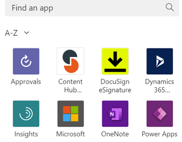
clip_image004Since the unveiling in February 2021, Viva functionality has been gradually added to a variety of Office 365 experiences from Topics (based on what was called Project Cortex), Learning (highlighting online learning materials from a selection of company-curated sources, including stuff from LinkedIn Learning), Connections (a modern take on the company intranet) and the first module which was available, Insights, which is accessed via an app in Teams.

The Insights-defined “Virtual Commute” and calendar-blocking Focus Time has been mentioned previously in ToW #577, but it’s had a new shot in the arm as well as announcements about forthcoming improvements, such as the ability for Teams to quieten notifications when you’re in a focus period, and quiet time when Teams and Outlook will shush pinging you outside of working hours.

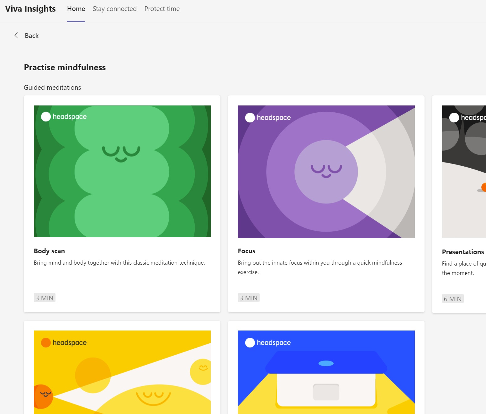
Now rolling out to Viva Insights is a set of mindfulness and meditation exercises curated from Headspace, who produce a load of online video as well as Netflix series and in-flight channels. See more about Headspace in Viva Insights, here.

clip_image005

577 – Wir Fahren auf der Autobahn (virtuell)

clip_image002Fans of the fathers of elektronische music will get the reference to the seminal track Autobahn, written to mimic the repetitive noises of driving along the motorway. Since most of us have not being doing much of that for a while (and nobody misses being stuck in a traffic jam on the M25 on a Friday evening), a new addition to Microsoft Teams from the previously announced Microsoft Viva could be a welcome distraction.

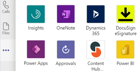
clip_image004Start by looking for the “…” menu on the left-side icons bar in the Teams client, and you’ll see additional apps that can be added to the menu (and once there, you can right-click on them to pin in place); a previous update to Teams lets you drag the icons’ placement to your own preference too.

You can jump between the apps in Teams by pressing CTRL+n, where n is the corresponding location on the bar (ie CTRL+1 for the top app, CTRL+2 for next down etc).

Open the Insights app to see the first-released Viva application, which has also been recently updated.

clip_image006

Viva Insights lets you send praise to colleagues, do some quick & mindful breathing exercises, check on actions you may have mentioned in email (eg “I’ll get back to you on Monday…”) and block out time that’s currently free in your schedule to give you a chance to focus on work you’re supposed to do, rather than meeting with people to talk about it.

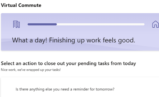
Newly added, is the Virtual Commute – go to the Protect Time tab, or look in the top-right settings menu “…”, to set up the time to finish your work day.

clip_image008

You can now have Teams remind you that it’s time to go home, even if you’re home already.

Jared Spataro wrote recently about the need to give yourself breaks between meetings and to transition from “work” to “home” modes.

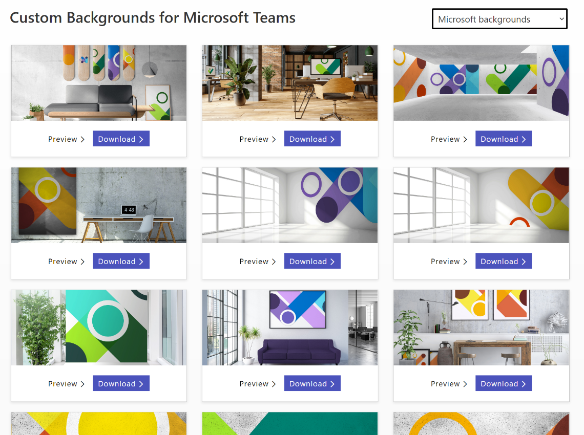
If you’d like to jazz up your Teams background image rather than showing your real backdrop, check out the Viva backgrounds now available in the custom backgrounds gallery for Microsoft Teams.

clip_image009