There’s been a trend in computing and related technologies running back to the birth of the Graphical User Interface in the 1970s at XEROX, for representing real-life things with digital versions that follow their design.
 Take your average Calculator app; its form has changed little from the desktop calculator on which it’s based, or any Calendar application used for organizing appointments which still follows the idea of a planner or physical monthly calendar.
This “skeuomorphic” approach has its pros and cons – it might be easier to pick up a new concept through association with the old way of doing it, but that might over-complicate things in the long run or just take up lots of space.
 How many people born in the 21st century have ever used a Floppy Disk, or the non-floppy version that is still widely used as the “save” icon? There’s even a meme about that.
When Apple brought out the first Mac forty years ago, the new paradigm of the “gooey” (or WIMP) extended to having a virtual desktop with things on it that might be on or beside your real desk – the wastepaper basket, a clock, a notepad, calendar, inbox and so on. Apple thought of these ancillary programs as “ornaments”, but the Mac and other OSs adopted them as widgets that could run on the desktop behind other application windows.
Apple’s commitment to a widget ecosystem has waned and come back to a degree, as has Microsoft’s – remember Gadgets in Windows Vista?
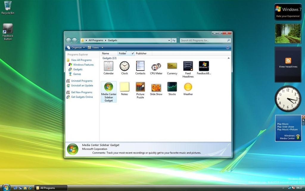
After parading the Sidebar and its gadgets as a new dawn for Windows, the whole thing was killed off after security vulnerabilities rendered it risky.
Widgets in Windows
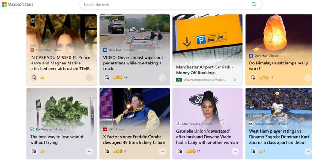
Windows 11 introduced “Widgets” (press WindowsKey+W to get them, or wave your mouse on the lower left of the screen) and later bulked up the UI with the same stuff you get on Microsoft Start, the Edge home page feed and so on, which probably means few people will use Widgets unless they want to find out about that heater that energy companies don’t want you to find out about, or that one thing (do it) that all Android users should know.
Great news, readers! The ability to switch off the “News” section is coming; at the moment, it’s dribbling out to some users on the Windows Insider program but at some point will be more widely available – read all about it here.
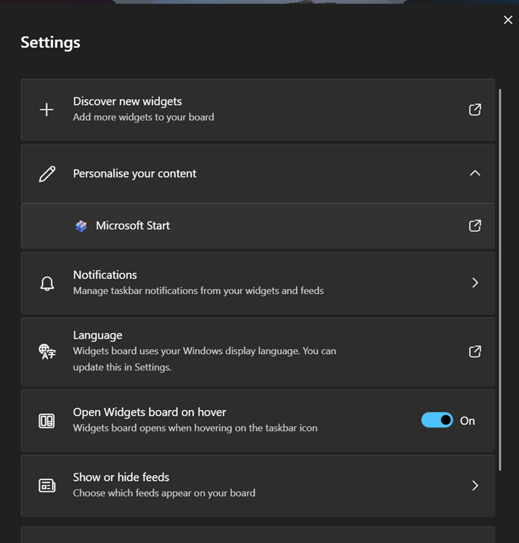
If you get the option (you should see a settings icon at the top of the Widgets board, rather than having to click on your profile photo to get to Settings), you can go into the Show or hide feeds option and be able to switch off the Start feed.
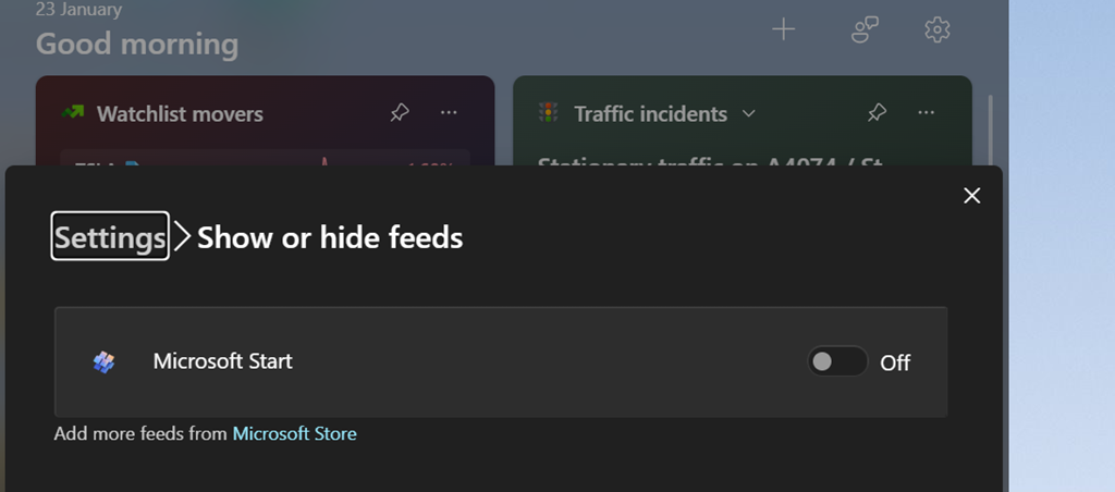
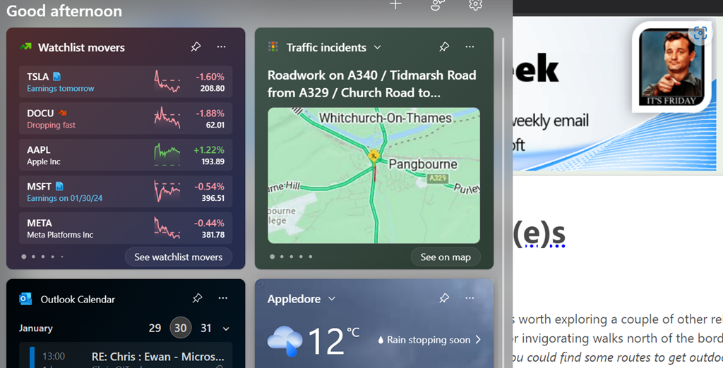
As well as being able to control the entire “feed” of content and present the gadgets on a 2-wide grid instead of a single column to the side, this update lets you choose which account to use to sign in to the Widgety experience, thus allowing users to sign in with their M365 account and use the widgets to surface stull like To-Do lists of tasks, or Outlook Calendar, showing data from their work or school account rather than only the Microsoft Account that it was previously locked to.
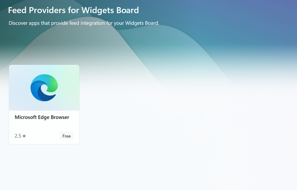
At some point, it looks like the Widgets feeds will be supplemented by other sources besides the Microsoft Start one (via the Add more feeds from Microsoft Store link in the show/hide feeds settings), with enthusiastic content providers lining up to publish their high-quality materials for all to consume…
