|
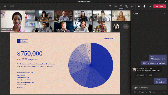
Some would apologize for the fact that the chart/table of data/timeline with 6pt text annotations etc, was too small for the audience to read. “I know this is an eye chart, but…” So hurray when all such in-person meetings were banished to Teams or Zoom if you’re lucky, or if you’ve been a horrible person in a previous life, you may have inflicted upon you Webex, Amazon Chime or whatever Google calls Hangouts these days. When presenting in Teams, there are some simple best practices to follow; some have been covered previously in ToW 576, with more online elsewhere.
As well as tweaking the layout, and hiding/showing components like chat or the participant list, you can zoom the Teams client in and out by using CTRL = and CTRL – (or CTRL + / – on your numeric keypad if you have one), or by holding CTRL and moving the mouse wheel up and down, if you have a suitably-equipped rodent connected. This method, however, just makes the Teams UI get bigger and smaller, so although it might increase the size of the pane being used to present content, it is a marginal gain.
|


